
Sensory-friendly shelter spaces are often mistaken for a few soft colors and a quiet corner. But if the intake desk is glaring, the hallway echoes, and every room feels exposed, families stay on alert.
For shelter leaders, partners, donors, and volunteers, the real work is noticing what residents have to endure all day: noise, clutter, harsh light, no place to exhale.
Start by looking for:
- Fluorescent glare near beds and bathrooms
- TVs or hallway noise bleeding into rest areas
- Crowded furniture that leaves no private zone
Help people settle, not just stay.
What Sensory-Friendly Shelter Spaces Really Mean
When we talk about sensory friendly shelter spaces, we don’t mean rooms that simply look nice in photos. We mean spaces that lower unnecessary stimulation so people can settle, think, sleep, parent, and make it through the day without their nervous system getting hit from every direction.
A sensory-friendly space supports comfort, predictability, privacy, and regulation. That’s true for children, but it is not only about children, and it is not only about autism. In shelters, we see the need just as clearly with women, teens, and whole families carrying trauma, grief, displacement, exhaustion, and chronic stress.
A clean room can still feel unsafe. A functional room can still keep someone on edge.
The difference usually shows up in details people overlook:
- light that doesn’t glare or flicker
- sound that doesn’t bounce down the hall
- textures that feel soft instead of cold and plastic
- furniture placed so people can move without brushing past strangers
- visual simplicity, so the eye can rest
Those choices affect daily life fast. They shape whether someone can fall asleep, calm a child, eat a meal without shutting down, finish paperwork, or sit through a case management conversation without feeling flooded.
Shelter design either mirrors crisis or gently interrupts it. That’s the line we care about.
Why Families in Crisis Need More Than Basic Safety
A roof matters. A lock matters. A bed matters. But if the environment stays loud, exposed, harsh, and unpredictable, many residents still won’t feel safe in their bodies.
That’s the piece that gets missed.
Trauma often sharpens sensitivity to things other people filter out. Fluorescent glare, crowded rooms, sudden noise, visual clutter, strong smells, and the feeling of being watched can all keep the nervous system in defense mode. A mother may look “difficult” at dinner when she’s actually overloaded. A child may seem defiant when he simply can’t settle.
In shelters, overstimulation tends to show up in very ordinary moments:
- trouble falling asleep even when everyone is exhausted
- irritability over small interactions
- constant vigilance in shared spaces
- shutdown during intake or services
- more conflict between family members
- kids who ping from one activity to the next and then crash hard
Calming environments for trauma survivors aren’t a luxury layer on top of safety. They are part of safety. Physical security without felt safety doesn’t get you very far.
Women and children are often carrying the brunt of this in shared settings. If the lounge feels chaotic, if bedrooms feel exposed, if the hallway outside sleeping rooms never quiets down, the message is clear even when no one says it: stay alert.
We use trauma-informed design because the environment can reduce stress and anxiety, restore dignity, encourage connection, support healing, and even help staff breathe a little easier. We’ve also seen that design choices tied to safety and dignity can change how people report their experience of a space.
A gentle environment gives residents a chance to exhale. Not forever. Just enough to orient, trust the next hour, and engage.
Signs Your Shelter May Be Causing Sensory Overload Without Meaning To
Most shelters don’t set out to create stress. The harder truth is that many stressors become normal once staff have worked around them long enough.
So start by looking at the building like a tired parent would. Or a child who hasn’t slept well in days. Or a survivor who is scanning every room for threat before she sits down.
Some common red flags:
- fluorescent glare in bedrooms, bathrooms, or intake
- televisions running constantly in shared rooms
- echoing hallways where every voice carries
- furniture packed too tightly, so movement feels cramped
- strong color contrasts or busy walls that keep pulling attention
- plastic-heavy surfaces that feel cold and loud
- strong cleaning or food odors with nowhere to get a break
- little control over personal space, even for a few minutes
Intake deserves extra scrutiny. If paperwork happens under bright lights, within earshot of other residents, with people moving past the desk every thirty seconds, residents can feel exposed before they’ve even had a chance to arrive emotionally.
Children’s areas can be just as tricky. We all like cheerful spaces, but “cheerful” can slip into dysregulating fast. A play zone with bright bins, mixed toys, wall decals everywhere, and no visual separation from a busy corridor doesn’t usually calm children down. It winds them up.
Bedrooms tell the truth. If every surface is hard, every sound travels, and there’s nowhere to retreat visually, the room may be technically usable but emotionally unsafe.
Reducing sensory overload in shelters starts by tracing friction points from arrival to bedtime. Where do people tense up? Where do staff raise their voices? Where do meltdowns happen by the second afternoon, not because anyone failed, but because the setting keeps asking too much?
The Design Principles Behind Creating Gentle Shelter Spaces
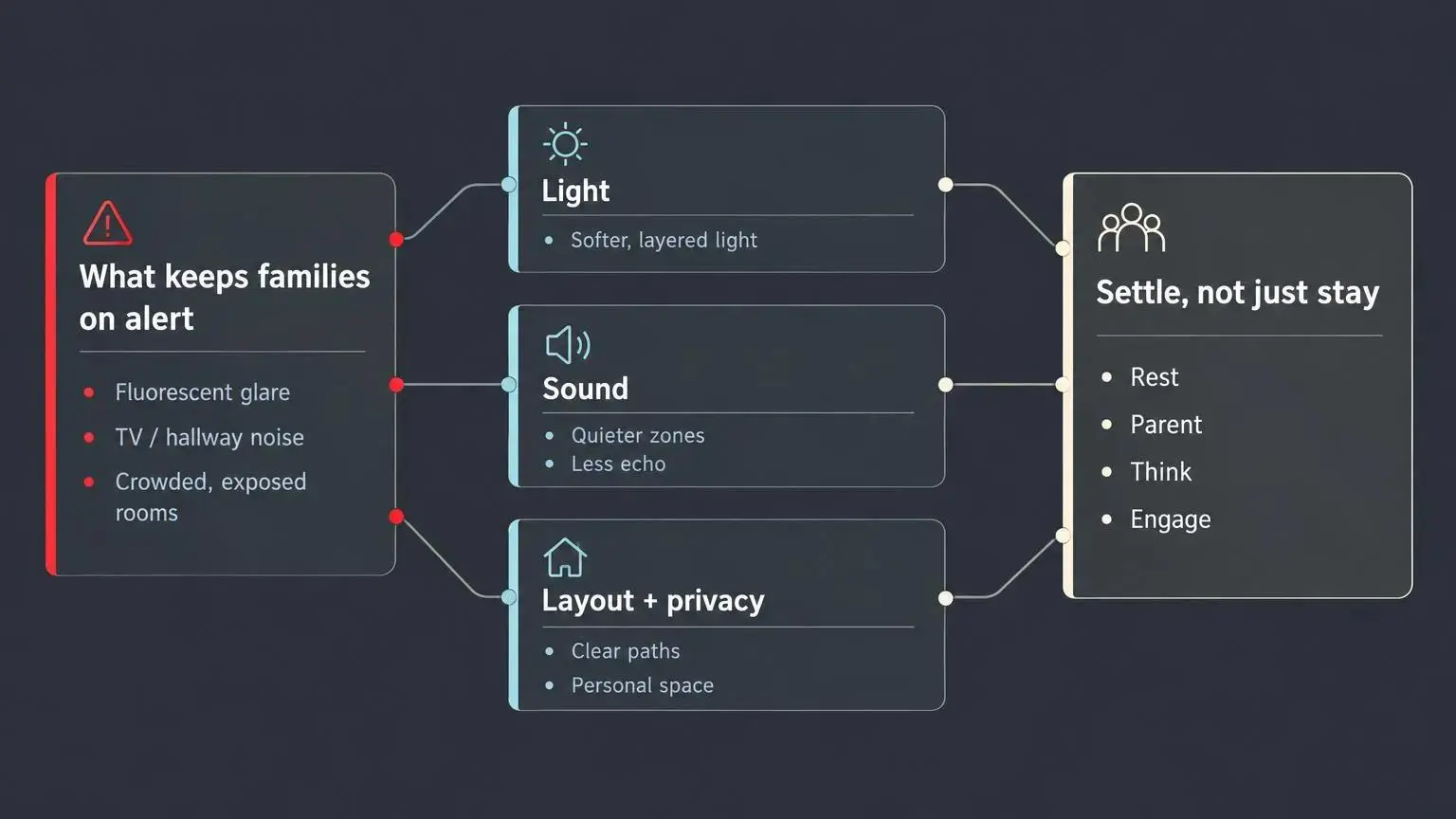
You don’t need a design degree to spot what helps. You do need a framework, because otherwise shelters end up fixing whatever looks worst instead of what strains residents most.
Light
Harsh overhead lighting does real damage in shelter settings. Softer, layered light usually works better when possible: lamps, warmer bulbs, task lighting where people need to read or sort belongings, and less dependence on one bright ceiling fixture.
Good visibility still matters. Staff need to supervise and residents need to feel secure. But there is a big difference between “we can see” and “everything is washed out.”
Sound
Noise is often the hidden problem. Echoes, loud shared media, alarms, rolling carts, slamming doors, hallway conversations, all of it adds up.
A few moves can soften the space:
- place softer furnishings where sound tends to bounce
- use rugs or textiles where maintenance allows
- create quieter zones away from circulation paths
- avoid putting child play right next to waiting or sleeping areas
If people have to keep raising their voice, the room is telling you something.
Color and texture
Calmer color palettes help, but sterile isn’t the goal. We want rooms to feel grounded and human, not drained of personality. Soft neutrals, gentle earth tones, and cohesive color choices usually outperform loud contrasts.
Texture matters more than many teams expect. Durable can still feel warm. Bedding, curtains, upholstered seating, pillows, and even wall finish choices change how a room lands in the body. Touch is not a small thing when someone’s world has felt rough for a long time.
Layout, privacy, and control
Predictable layouts lower cognitive load. People under stress don’t need to solve the room before they can use it.
Keep pathways clear. Give furniture enough breathing room. Let the use of the space make sense at a glance.
Then add small forms of control:
- a personal zone around each bed
- visual shielding where possible
- a quiet corner to step away
- hooks, storage, and surfaces that help residents manage belongings
This is where creating gentle shelter spaces becomes practical. Trauma-informed design is not a decorating style. It’s a way of using the environment to say: you are safer here than you were five minutes ago.
How to Design Low-Sensory Rooms and Shared Areas That Actually Work
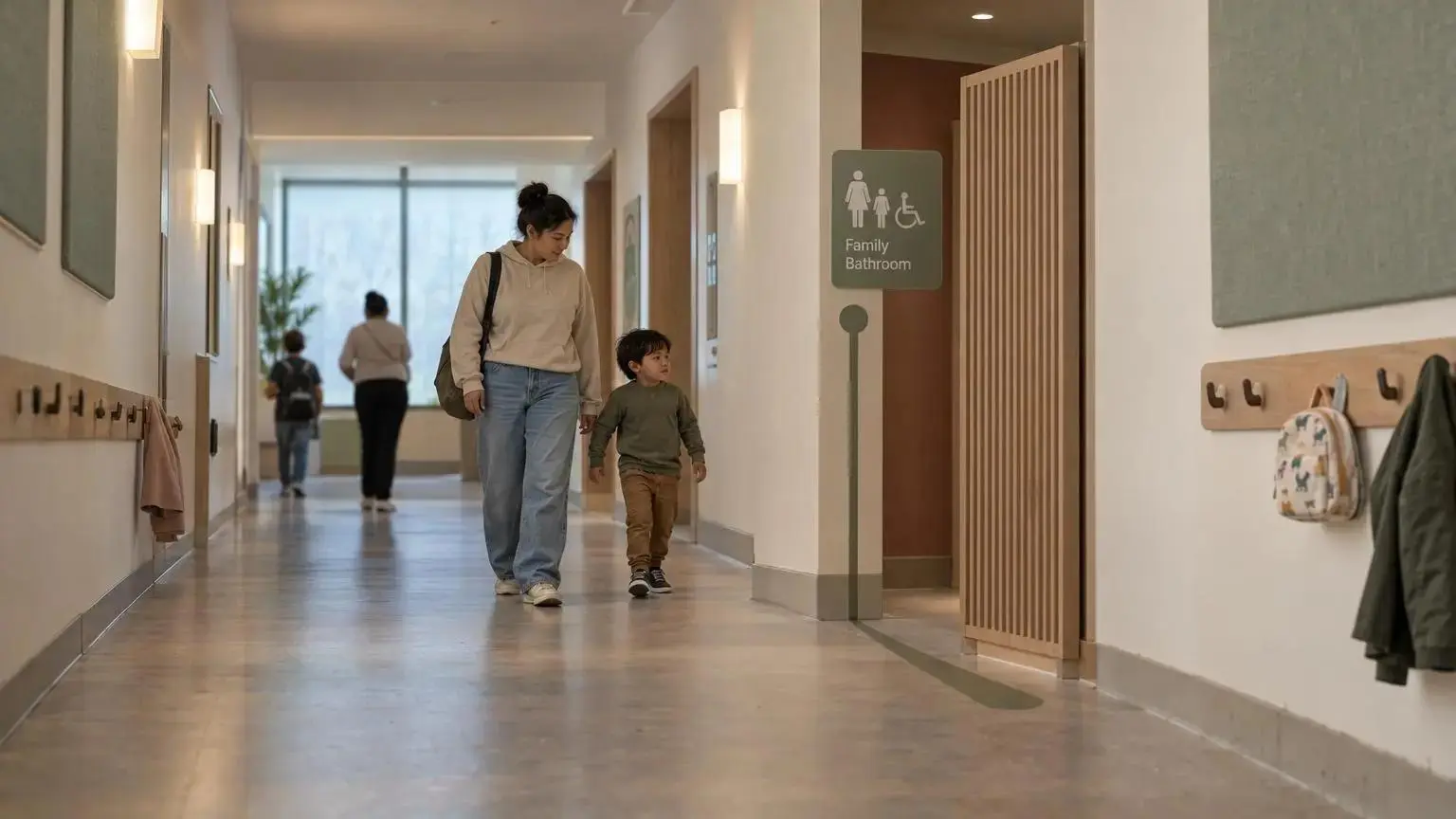
Low sensory room design for shelters works best when each area has a job and the design supports that job. Sounds obvious. It often isn’t.
Bedrooms and family rooms
These spaces should support rest and decompression first. That means calming colors, soft bedding, supportive furnishings, less visual clutter, and layouts that don’t crowd the bed or block movement.
Privacy features matter here more than people think. Even a small amount of visual separation helps residents feel less exposed. Child-friendly touches help too, but they shouldn’t take over the room. A family room isn’t more caring because it is louder.
When a shelter wants focused bedroom-level improvement rather than a full building overhaul, our Room Makeovers can be a strong fit because they address these room-by-room details through a trauma-informed lens.
Intake spaces
First impressions aren’t branding. They’re regulation.
A quieter waiting experience, clearer wayfinding, less visual noise, and more dignity during paperwork can change the tone of the whole stay. If intake feels rushed or public, trust starts in a deficit.
Common rooms, playrooms, dining, and transition spaces
Shared areas need zones. Conversation, waiting, reading, screen time, and quiet should not all fight for the same square footage.
A few practical distinctions help:
- Common rooms: avoid mixed-purpose storage spilling into sightlines; too much visible stuff makes the room feel busy before anyone speaks
- Playrooms: include movement and comfort, not just stimulation; children need places to climb into calm, not only toys that rev them up
- Dining areas: pay attention to line flow, seating density, and sound; mealtime conflict often starts with congestion, not attitude
- Bathrooms and hallways: cold lighting, echo, no hooks, and poor privacy wear people down every single day
Sometimes the hardest-working spaces in a shelter are the transitional ones. Hallways, waiting corners, bathroom entries. If those feel jarring, the rest of the building has to work harder to compensate.
A Practical Process for Assessing and Prioritizing Changes
Most teams don’t need more ideas. They need a way to decide what to do first.
Start with observation. Walk the shelter early in the morning, during intake, around dinner, and near bedtime. Different problems show up at different hours. The hallway that seems fine at 10 a.m. may be the loudest part of the resident experience at 8:30 p.m.
Watch for patterns:
- where children melt down
- where staff voices get sharper
- where residents linger because the space feels easier
- where they avoid sitting at all
- where transitions bog down
Then ask residents and staff direct questions. Not “do you like the room?” Ask what feels loud, harsh, exposed, confusing, or hard to use. Ask what makes bedtime worse. Ask what part of the day feels longest.
After that, sort your findings by impact. Bedrooms, intake, family common areas, children’s spaces, and hallways near sleeping rooms usually carry the heaviest sensory burden.
A simple way to phase changes:
Phased improvement path
- Immediate
declutter, rearrange furniture, reduce visual load, change how TVs or shared media are used, swap bulbs where possible
- Moderate
add softer textiles, privacy layers, better storage, calming furnishings, lighting improvements
- Larger scope
update flooring and finishes, improve acoustics, redesign common areas, rethink circulation and room use
Don’t prioritize the space that looks easiest to photograph. Prioritize the space that asks the most from stressed families.
Our trauma-informed design process follows this same logic. We look at resident and staff needs, assess light, sound, color, layout, and privacy, then build a plan and evaluate what changed in real use.
Common Mistakes That Undermine Sensory Comfort in Shelter Design
A lot of well-meant updates backfire because they confuse “welcoming” with “more.”
More color. More signage. More furniture. More decor. More themes.
Usually, more is the problem.
A bright, busy room can feel cheerful to someone who visits for twenty minutes and exhausting to someone who has to sleep there. The same goes for children’s spaces. If every wall is talking, none of it is calming.
Other mistakes show up in plainer ways:
- choosing only for durability and ending up with cold, loud, institutional surfaces everywhere
- fixing aesthetics while ignoring acoustics, sightlines, and personal space
- leaving shared spaces fully open with no retreat zones
- arranging rooms for staff efficiency alone while overlooking the resident experience
- stripping rooms down so far they feel clinical instead of human
Low sensory room design for shelters should still feel warm and age-appropriate. Quiet does not mean empty. Calm does not mean bare.
The test is simple: can a resident settle here, or does the room keep asking them to adapt?
Budget-Conscious Ways to Reduce Sensory Overload in Shelters
Budget limits are real. Aging buildings are real. Donated items that don’t quite fit the space are very real. None of that means you have to wait for a full renovation before making things better.
Some changes cost little or nothing:
- declutter surfaces and remove duplicate signage
- spread furniture out so movement feels less cramped
- define a quiet corner in a common room
- turn off constant TV when it isn’t serving residents
- group similar items into closed or neater storage
- swap the loudest visual combinations for calmer ones where you can
Moderate investments often go further than people expect. Softer textiles, lighting updates, privacy solutions, better storage, and durable calming furnishings can take a room from tense to usable.
Larger capital improvements matter too, especially when the building itself is doing the damage. Flooring, wall finishes, acoustic treatment, and redesigned common areas change the baseline experience, not just the appearance.
Think in phases. That’s how most shelters get there.
It’s also worth steering donor energy toward actual environmental needs instead of decorative extras. A donated chair that fits the plan helps. Ten random bright items that add clutter do not.
When the problem extends across intake, common areas, and resident rooms, a broader approach may make more sense. Our Full Shelter Renovations are built for that kind of need, where isolated updates won’t solve what the overall environment is still saying.
| Move | When it fits | Example actions |
|---|---|---|
| Immediate low- or no-cost changes | Use when you need to improve the space now and cannot wait for a full renovation. | Declutter surfaces, remove duplicate signage, spread furniture out, define a quiet corner, turn off constant TV, use closed or neater storage, and swap louder visual combinations for calmer ones. |
| Moderate investments | Use when targeted upgrades could take a room from tense to usable. | Add softer textiles, lighting updates, privacy solutions, better storage, and durable calming furnishings. |
| Larger capital improvements | Use when the building itself is doing the damage and you need to change the baseline experience, not just the appearance. | Update flooring, wall finishes, acoustic treatment, and redesigned common areas. |
| Broader renovation approach | Use when problems extend across intake, common areas, and resident rooms and isolated updates will not solve the overall environment. | Plan changes across intake, common areas, and resident rooms instead of adding decorative extras or random donated items that add clutter. |
How to Know the Space Is Helping Residents and Staff
You do not need perfect data to know a room is working better. You need honest observation and a few useful comparisons.
There is limited shelter-specific outcome research, but one program evaluation of bedroom redesigns at two North Carolina homeless shelters surveyed 61 residents. Of the 43 residents who completed both the pre- and post-design surveys, scores for preparedness, hopefulness, and safety all improved significantly; safety and the combined score showed the largest effects. In follow-up comments, 17 residents described greater dignity, 13 described greater safety, and 4 described greater hope.
That makes resident-reported safety, hope, and dignity practical outcomes to track alongside day-to-day function. Look for changes in:
- residents settling into sleep routines with less struggle
- calmer transitions between meals, services, and bedtime
- fewer conflict flashpoints in shared spaces
- quieter use of lounge or retreat areas
- staff interactions that feel less strained
- stronger resident feedback about privacy, comfort, safety, and dignity
Keep the measurement simple if you need to. Use the same short resident check-in before and after a change, then pair it with staff notes and observations over several weeks. Ask residents whether the space feels safer, more private, more hopeful, or easier to use—not only whether they like how it looks.
The North Carolina evaluation was small and focused on bedroom updates, so it cannot prove that every design change will produce the same result. Still, it offers a useful model: measure the experiences the space is meant to change, then revise the work if residents are not feeling the difference.
Conclusion
Sensory friendly shelter spaces are not decorative extras. They are practical tools that support regulation, trust, privacy, and dignity for families in transition.
Calming environments for trauma survivors are built through dozens of small decisions about light, sound, texture, layout, and control. Most of those decisions are quiet. Their effect is not.
Start with one high-stress area. Walk it with fresh eyes. Notice where the environment still sounds, looks, or feels like crisis, then make the next change that helps residents breathe a little easier in the space around them.