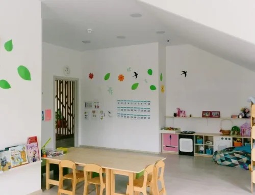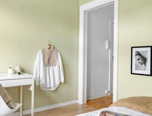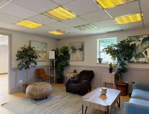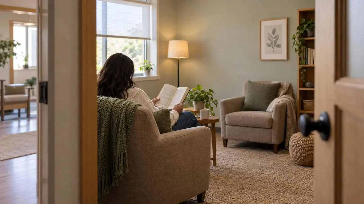
Domestic violence shelter common room ideas matter because one oversized lounge with a TV, harsh lighting, and nowhere to step away can make an already hard day feel louder. You need more than seating. You need choices.
Start with how residents actually move through the room: where children play, where someone can sit without being watched, where a conversation can stay private. Don’t let donated clutter decide the layout.
Make shared space feel safe, useful, and human.
1. Quiet Room
If a shelter has only one shared room, that room usually gets asked to do too much. TV area, waiting room, family hangout, intake overflow, kids’ play zone, hard conversation corner. That’s how a room becomes tiring fast.
A quiet room gives residents a place to step out of that pressure without being sent back into isolation. In shelter settings, privacy is one of the needs that keeps coming up and often stays unresolved. A second low-stimulation room helps adults and children choose when to engage and when not to.
One practical version is simple:
- no TV
- no stereo
- a phone
- comfortable seating
- softer lighting, if possible
That sounds almost too basic. It isn’t.
In shelter focus groups, quiet rooms were named favorite spaces by nearly every adult and child. We pay attention when something gets that kind of response. It usually means the room is solving a problem staff have gotten used to living with.
A bedroom is not the same thing. Bedrooms can feel private, but they can also feel cut off. A quiet room gives someone a middle option: alone enough to settle, connected enough not to disappear.
Best fit: shelters where one common room is carrying the whole building, especially family shelters and older houses where sensory overload shows up by the second afternoon.
2. Alcoves and Window Seats
Not every building can carve out a full quiet room. That’s where alcoves, window seats, and other edge spaces start pulling real weight.
These small retreat zones work because they let a resident keep some distance without leaving the room entirely. In community room design for shelters, that matters more than people think. Being able to sit slightly apart, with a side view of the room instead of being in the middle of it, can lower the social pressure immediately.
A large open lounge can look generous on paper. In practice, it often feels exposed.
Children usually claim these spots first. Adults do too, especially when they want a break from interaction but don’t want questions about where they’re going. That’s the quiet value of peripheral space. It creates boundaries without making a show of it.
If you’re working with an existing lounge, try changing the edges before you assume you need more square footage. Built-in seating, a tucked reading chair, a partial divider, even the way furniture faces can create that middle ground.
Good shared space gives people options without making them ask for permission.
Best fit: shelters that need comfortable shelter lounge ideas but can’t add a new room.
3. Multipurpose Lounge
A multipurpose lounge has a different job than a quiet room. It’s the place for daily life. Families gather there. People wait there. Kids drift in and out. Staff conversations happen nearby. If the room doesn’t work, everyone feels it.
We think the first test is blunt: can the room actually hold people? At Artemis House, a common area that could only seat two people at a time was reworked into a real gathering space for families. That lesson lands hard. If a room can’t comfortably seat the people who need it, it isn’t functioning as shared space.
The fix isn’t always dramatic. Often it’s a mix of enough seating, better layout, warmer materials, and less clutter. Decluttering matters more than donors sometimes realize. Piles of extra items, mismatched storage, and overflow donations can make a room feel stressed before anyone even sits down.
Formal program rooms still matter. But the lounge carries the emotional weather of the shelter. If it feels cold, cramped, or temporary, residents read that right away.
Best fit: shelters trying to improve healing common areas without building an addition.
4. Sensory Room
A sensory room is a more intentional answer to a problem many shelters already see: a resident gets overwhelmed by noise, smell, lighting, textures, color, or group activity and has nowhere regulated to recover.
A corner of the lounge won’t do the same job.
At WomenSafe, the push for a sensory room came from seeing how communal living could overload survivors with sensory processing needs. That’s not a fringe issue. In shelter, the ordinary background of shared life can hit like static that never turns off.
The setup can be phased:
Setup sequence
- Clear space
Clear out a vacant room.
- Prepare room
Paint and prepare the space.
- Lighting and security
Add lighting elements and needed security features.
- Sensory items
Bring in sensory materials and calming items.
The point is not decoration. The point is de-escalation.
For residents in acute transition, a dedicated sensory room can support mental and physical relaxation in a way a standard common area rarely can. It also gives staff a better response than asking someone to “take a minute” in a building that may not offer any true calm.
Best fit: shelters seeing repeated sensory overload, dysregulation, or crisis cycling in shared spaces.
5. Therapy Room
If counseling is happening in hallways, borrowed offices, or half-private corners of the lounge, the shelter is making hard conversations harder than they need to be.
A dedicated therapy room changes that. At Artemis House, a case manager’s office was converted into a therapy room with two armchairs. Small move. Big difference. A room doesn’t need to be elaborate to feel contained and safe.
In shared environments, privacy is fragile. People lower their voices, pause, edit themselves, or skip the conversation entirely when they know others are nearby. That’s not a small loss. It affects trust.
A dedicated room offers:
- consistency
- confidentiality
- a calmer setting for support conversations
- less spillover into general common areas
Trying to carve out privacy inside a busy room almost never works as well as people hope. Sound travels. Kids wander. Someone needs the table. We see this a lot.
Best fit: shelters already offering counseling, advocacy, or case support but lacking a room that matches the seriousness of the work.
6. Children’s Play Area
Family shelters need shared spaces that support parenting, not just occupancy. That’s the difference between a room that looks functional and one that actually helps.
At LoveHouse Shelter, moving the children’s play area within eyesight of the kitchen improved day to day life in a very practical way. Caregivers could prepare food or talk with staff while still supervising their children. That’s the kind of change that lowers stress immediately.
A separate playroom can sound better. Sometimes it is. But if parents lose line of sight, that separation can create more tension than relief.
This is one of the most useful domestic violence shelter common room ideas because it helps with routine, and routine is where a lot of shelter strain shows up. Meals, supervision, sibling conflict, cleanup, transition time. The room either supports those moments or fights them.
Best fit: family shelters, especially older homes where every room has to work harder than it was built to.
7. Library
A library changes the tone of a shelter in a way a waiting area never will. It suggests thought, learning, privacy, and dignity. That’s not a soft benefit.
At Haven’s new facility in Bozeman, a library sits within the public-facing part of the building alongside counseling and gathering spaces, while residential areas stay protected behind that front zone. That’s smart planning. Openness and safety do not need to cancel each other out.
A library can support quiet engagement without the social demand of a lounge. It gives residents, children, visitors, and partners a more humane threshold into the building. For some programs, it also helps reset how the shelter is perceived by the wider community.
This idea isn’t for every building. If your layout can’t separate public and protected space, force-fitting a library can create problems. But where the zoning works, it can become one of the most grounded shared spaces in women’s shelters.
8. Community Gathering Space
A community gathering space is not the same as a lounge, even if the furniture overlaps. The lounge handles everyday living. A gathering room handles intentional togetherness.
This kind of space is useful when you need room for workshops, support groups, family activities, staff-led programming, or community events. Haven included community gathering spaces for exactly that reason. The room supports connection, education, and dialogue while the rest of the shelter still protects resident safety.
The best versions are flexible but not vague. People should understand what the room is for without feeling locked into one use. That’s a hard balance.
In trauma informed shared spaces, group rooms work best when they support:
- safety
- trust
- choice
- collaboration
- personal control
Those values show up in layout as much as in programming. A room that feels exposed or overly managed won’t get used the way staff intended.
9. Green Space
Healing common areas do not have to stop at the back door. Some of the best regulation happens outside.
Green space belongs in this conversation because outdoor common areas support movement, fresh air, quiet, and recovery in ways indoor lounges can’t. Research on women-centered supportive housing treats green space as a real common-space category, not a bonus feature.
At Haven, the site includes walking paths, quiet seating areas, and places for play and healing. That’s a strong model, but the idea scales down. A yard edge, a small courtyard, a fenced garden, even one shaded sitting zone can change the rhythm of a day.
Indoor improvements matter. We do them every day. But if residents can step outside safely for five minutes without leaving care behind, the whole building feels different.
Best fit: shelters with any outdoor area that can be made safer, calmer, and more usable.
10. Cultural Room
A neutral room is not always neutral. Sometimes it just feels generic.
A cultural room gives a shelter a place to reflect the identities and histories of the people it serves. The Cultural Room at Elizabeth Fry’s Amber House in Prince George is a useful example because it shows this isn’t theoretical. These spaces exist, and they matter.
When people have been displaced by violence and crisis, familiarity carries weight. Cultural relevance can help residents feel seen in ways beige walls and generic decor never will. Comfort isn’t only about softness. It is also about recognition.
This idea is especially strong for organizations serving diverse communities or trying to make community room design for shelters feel more rooted and less institutional. A room can be calm and still have a point of view.
11. Flexible Common Areas
A lot of shelters operate in buildings that were never meant for communal living. Donated homes. Retrofitted facilities. Rooms with odd traffic patterns and too many jobs.
That’s why flexibility matters.
At LoveHouse, small changes to improve flow and make common areas more flexible helped the building work better without waiting for a full rebuild. We like this section because it keeps people honest. Not every fix requires architectural drama.
Flexible common areas can:
- support different ages at once
- shift between quiet and active use
- reduce dead space
- make limited square footage go further
Fixed single-use rooms sound tidy, but they often sit underused while the rest of the shelter gets overloaded. Thoughtful rearrangement is usually the first move before larger renovation dollars show up.
12. Open Sight Lines
Open sight lines are one of those design decisions that look subtle on a floor plan and feel huge in real life.
When residents can see who is in a room before entering, they get more control over their own social exposure. Interior windows, cutouts, and clearer visual paths can make common areas feel less unpredictable. That matters for anyone arriving in crisis, but especially for residents whose nervous systems are already scanning for threat.
This is also about accessibility. Clear visual access supports residents who are deaf, hard of hearing, or use sign language.
Blind corners and closed off entrances create a different feeling. You have to walk in first and assess second. That’s backward for trauma informed shared spaces.
People settle faster when the room doesn’t force surprises on them.
Good visibility can also reduce the need for staff to over-manage interactions. Design does some of that work for you.
Language access belongs in the assessment, too. In a nine-month, four-state study of 1,467 survivors using 90 domestic-violence programs, 31% completed the survey in one of eight languages other than English. The study examined non-residential services rather than shelter layouts, so it does not measure the effect of any particular room feature. It does give a concrete reason to learn which languages residents use before assuming a common area is easy to navigate.
13. Art and Murals
Art is not fluff in shelter work. It changes how a room speaks before anyone says a word.
Residents in shelter focus groups have said clearly that they value art, inspiration, and beauty. We believe them. A room that feels cared for tells residents they are worth care too.
The good news is that this doesn’t require expensive materials. Strong art choices can come from:
- color
- local imagery
- references to nature
- texture
- murals that help children orient themselves
One example we keep coming back to is a hallway mural with jungle animals leading to a children’s therapy room. It gave kids a landmark and made the walk less intimidating. That’s design doing actual work.
Practicality still matters. Durable finishes matter. But choosing only dark, heavy surfaces because they hide wear can make a room feel harder than it needs to.
14. Accessible Kitchen
An accessible kitchen belongs on this list because common life in shelter is shaped by more than the lounge. If residents can’t use the kitchen independently, the environment is not fully supportive.
This is a dignity issue. It is also an equity issue.
A technically available kitchen can still exclude residents with mobility challenges, injuries, or other disabilities if the layout fights them at every step. We think this gets missed because people assume access starts and ends with entry. It doesn’t. Usability is the test.
There’s also a family function piece here. When kitchens are planned with visibility to nearby child-friendly space, daily life gets easier. That same line-of-sight lesson from play areas matters here too.
Best fit: shelters serving families, multigenerational households, or residents recovering from physical harm.
How to Prioritize These Ideas in Real Community Room Design for Shelters
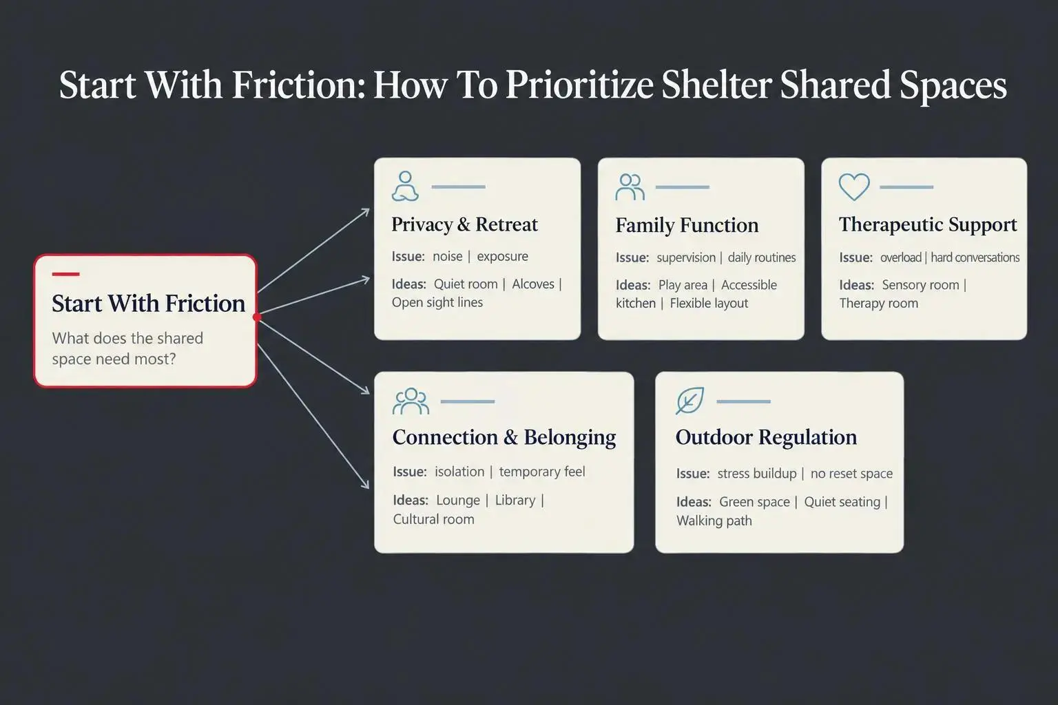
Start with friction, not a wishlist. Where is the building breaking down? Noise, privacy, child supervision, sensory overload, confusing circulation, inaccessible daily-use space. Those patterns tell you what to do first.
We’d group decisions like this:
- privacy and retreat: quiet room, alcoves, open sight lines
- family function: play area, accessible kitchen, flexible common areas
- therapeutic support: sensory room, therapy room
- connection and belonging: lounge, gathering space, library, cultural room, art
- outdoor regulation: green space
Then separate low-lift moves from capital projects. Layout changes, decluttering, art, and a basic quiet room may happen sooner than a new library or kitchen redesign.
Before buying furniture, assess the room itself:
- light
- sound
- softness
- traffic flow
- visual exposure
And ask residents. Staff and donors can misread a room badly. Something that looks inviting may still feel overstimulating, impractical, or too exposed to the people living there.
If your shelter needs broader change across lounges, playrooms, kitchens, gardens, or lobbies, this is where a trauma-informed process helps. Our Trauma-Informed Design approach looks at privacy, layout, lighting, sound, and daily-use patterns before renovation choices get locked in. And when the work needs to move beyond one room, our Full Shelter Renovations support larger common-area changes across the building.
Common Room Design Mistakes That Undercut Healing
Some room problems are really planning problems. We see the same mistakes repeat.
- expecting one room to meet every need at once
- choosing trendy finishes while ignoring regulation, privacy, and supervision
- leaving no middle ground between full exposure and total isolation
- creating blind entrances and unknown social situations
- trying to solve design problems with more rules
- overlooking accessibility in kitchens and circulation paths
- letting cluttered donations take over the room
- using dark or institutional materials just because they seem practical
Too many rules can make a shelter feel controlling in ways that echo what residents are leaving. That’s not a minor concern. The room should carry some of the burden so staff don’t have to enforce comfort that design never supported.
Conclusion
The best domestic violence shelter common room ideas do the same deeper work. They restore choice, reduce overwhelm, support parenting, protect privacy, and make shared life feel more human.
Healing common areas are built through layout, visibility, softness, accessibility, beauty, and clear room purpose. Furniture matters, but it is not the whole story.
If you’re not sure where to begin, start with the room causing the most friction. Fix the place everyone braces themselves before entering.
If your organization is rethinking a lounge, playroom, kitchen, garden, or a broader shared environment, we can help with trauma-informed planning, room makeovers, and larger common-area renovations. The goal isn’t to make shelter look nicer. It’s to help people exhale.