A shelter can have clean beds and locked doors yet still feel loud, exposed, and hard to breathe in. Trauma-informed design changes the signals a space sends before anyone says a word.
For shelter leaders, partners, donors, and volunteers, the work is less about making rooms look nice and more about reducing daily strain. A harsh hallway light at 2 a.m. matters.
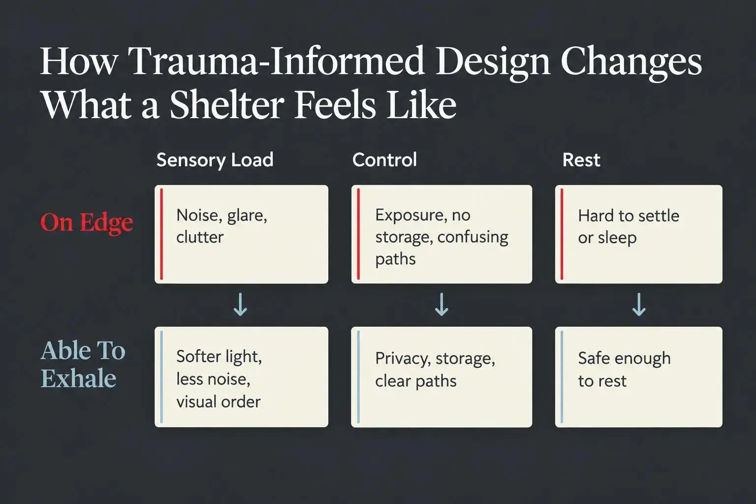
Look closely at what residents live with every day:
- Where noise, glare, and clutter keep people on edge
- How privacy, storage, and clear paths restore a little control
- Which small changes help a room feel safe enough to rest
Start where someone can finally exhale.

What Trauma-Informed Design Means in a Shelter Context
Trauma informed design starts with a simple idea: space affects the nervous system. In a shelter, that is not a side issue. It is part of care.
When we talk about trauma informed design, we mean translating trauma informed care into physical decisions. Layout. Lighting. Acoustics. Privacy. Color. Furniture. Storage. Sensory load. The goal is not to make a shelter look stylish or expensive. The goal is to reduce re-traumatization and help people feel safer, steadier, and more respected.
That matters deeply in shelters serving women, children, and families after domestic violence, homelessness, displacement, or another life-shaking event. A person may arrive with almost nothing, but they do not arrive without a nervous system. The room speaks to them before staff ever do.
The need is not marginal. A 2022 scoping review of trauma-informed supported housing cites the World Mental Health Survey finding that 70.4% of people worldwide have experienced a traumatic event in their lifetime. In interviews with people experiencing homelessness in Sydney, every woman interviewed and 90% of men reported lifetime trauma. Those figures do not describe every shelter population or predict one person’s needs. They do show why designs that assume residents will simply adapt to noise, exposure, confusion, or a lack of control are a poor fit for the people shelters often serve.
You’ll also hear nearby terms like sensitive design principles, healing environments in architecture, mental health focused design, design for emotional well-being, user-centered trauma care, and environmental design for recovery. They’re all circling the same truth: the built environment can either add stress or help the body unclench.
Basic function still matters, of course. Beds, bathrooms, locks, and security are essential. But function alone is not enough. A room can meet code and still feel unsafe. That’s the line too many people miss.
A shelter should not just contain crisis. It should lower the temperature of it.
Why the Built Environment Can Either Escalate Fear or Support Healing
People who have lived through trauma often scan a room fast. They notice exits, blind spots, noise, glare, crowding, exposure, and whether they have any control. They may not say any of that out loud. Their body says it first.
That is why common institutional features can work against your mission:
- harsh overhead lighting
- loud hallways and echoing surfaces
- confusing circulation
- crowded sleeping areas
- nowhere to store personal items
- seating that puts people on display
- hard, cold materials that feel punitive
None of those choices are usually malicious. Most come from budget pressure, old buildings, or a habit of treating shelter as temporary and therefore “good enough.” But temporary does not mean unimportant. Some of the most fragile moments happen in temporary places.
By contrast, calming spaces tend to share a few traits. They are easier to read. You can tell where to go. Noise is more controlled. There are places to sit without feeling watched. The layout feels predictable. Materials feel a little softer, a little warmer, a little more human.
This is not just about aesthetics. It affects psychological safety and physical safety together. A resident who feels constantly on edge is less likely to trust staff, less likely to rest, and less likely to use shared space in healthy ways.
For leadership, this starts at intake. The first hallway, first chair, first waiting area, first bedroom, those moments set the tone. Environmental decisions shape trust before policy ever gets a chance.
The Core Principles That Make Trauma-Informed Design Effective
There is no single trauma informed look. We get better results when we work from principles instead of copying a mood board.
The principles we come back to
Safety and security
People need to feel physically secure without feeling contained. Good sight lines help. So do buffered transitions between public and private areas. Too much exposure feels bad. Too much control also feels bad.Trust and predictability
Residents should be able to understand the space without a long explanation. Where do I sleep? Where do my children go? Where is the bathroom? Confusion raises stress faster than many leaders realize.Choice and agency
Small choices matter. A reading light. A place to sit away from others. A hook for a bag. A shelf that belongs to you. Control is often rebuilt in inches, not miles.Resident and staff voice
The strongest designs usually start with listening. Staff know where bottlenecks happen. Residents know what feels exposed, loud, confusing, or demeaning.Dignity
Durable does not have to mean harsh. Residential cues matter. Bedding, texture, decent furniture, and thoughtful storage all send the same message: you matter here.Connection without forced exposure
Community space should invite interaction, not demand it. People need a way to join and a way to step back.Nature and natural cues
Daylight, greenery, and natural materials show up again and again in healing environments in architecture for a reason. They help spaces feel less mechanical.Cultural and contextual relevance
Mental health focused design works better when the space reflects the people who use it. Generic “welcoming” can still feel alien.
A good design plan usually balances all of these. Push one too hard and you can create a new problem.
What Trauma-Informed Design Looks Like in Bedrooms and Sleeping Areas
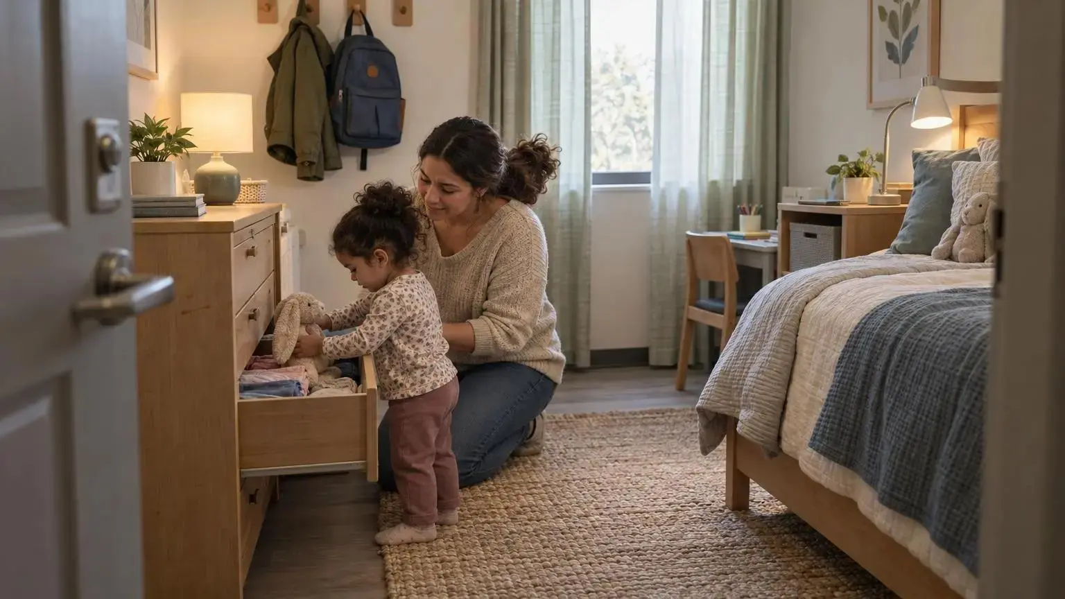
Bedrooms carry more emotional weight than almost any other shelter space. If sleep never feels safe, recovery gets harder fast.
The first priority is privacy, as much as the building and operations allow. That may mean private rooms, lockable doors where appropriate, visual separation, or simple dividers that reduce exposure. Even a modest increase in privacy can change how a resident holds themselves in the room.
A bed is not enough. People need refuge, control, and some trace of identity.
In practice, that often looks like:
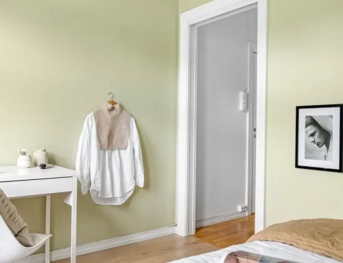
- calming, low-contrast colors instead of busy or highly stimulating palettes
- layered bedding and soft textiles that feel residential
- durable rugs where they make sense and can be maintained
- layouts that let someone rest without feeling cornered
- sound reduction between corridors and sleeping rooms
- real storage, not piles on the floor
- hooks, small desks for children, reading lights, pillows, toys, and privacy features
One detail operators notice quickly: storage changes behavior. When bags, papers, clothes, and comfort items have a place, the whole room feels more manageable. Clutter is not just visual. It can feel like instability made visible.
When room-level changes are the most realistic place to start, our Room Makeovers focus there. We redesign shelter bedrooms for families, women, children, and other residents using trauma informed design principles, with attention to calming colors, soft textures, layout, furnishings, and privacy. Sometimes the most meaningful shift starts with one room that finally feels like a room.
How Common Areas Can Become Stabilizing Instead of Stressful
Shared spaces shape the daily experience of shelter living. Lobbies, intake rooms, hallways, kitchens, dining areas, playrooms, bathrooms, laundry, lounges, meeting rooms, these spaces can either smooth the day or wear people down by noon.
The problem is usually friction. Too much waiting. Too much noise. Too much uncertainty. No clear place for children. No way to sit quietly. Everyone crossing through the same tight zone.
Where common areas often go wrong
A hallway becomes a waiting room. A dining area doubles as a conflict zone because there is no quieter seating nearby. Intake happens under bright lights with chairs set too close together. Play space is an afterthought, so children spill into adult areas and caregivers can’t rest without losing visual contact.
Clear wayfinding helps more than many people expect. Residents should not have to ask three times where to find meals, staff support, restrooms, or children’s areas. Repeated confusion drains people.
Shared space works better when it offers different modes of use:
- communal tables for those who want connection
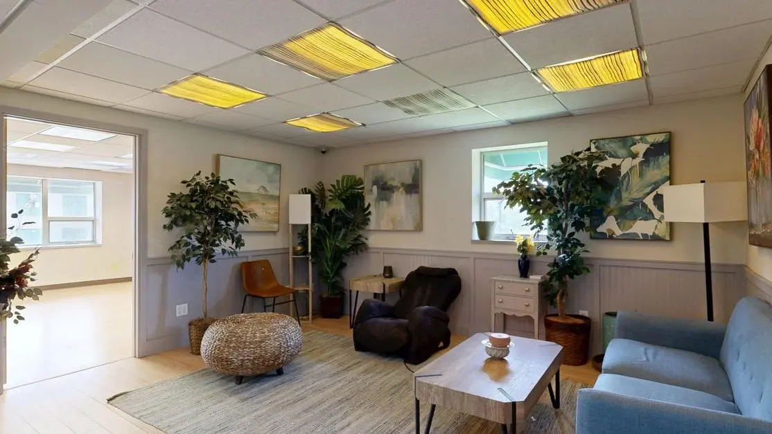
- softer seating zones for informal conversation
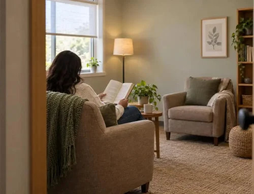
- quieter corners for people who need less stimulation
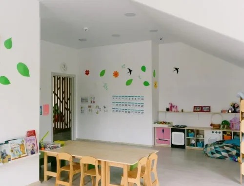
- visible play areas with child scaled elements
- intake and waiting areas arranged for dignity and privacy
If your biggest pain points live in common areas rather than bedrooms, a larger scope may be the right answer. Our Full Shelter Renovations are built for facilities that need broader changes across shared environments, from intake rooms and dining halls to playrooms, kitchens, and lobbies.
Privacy Without Isolation: Balancing Openness, Supervision, and Choice
This is where many shelter leaders get stuck, and for good reason. You need safety. You also do not want residents to feel watched all day.
Open sight lines can help staff monitor spaces and reduce hidden risk. But if every seat is exposed and every conversation carries, the room starts to feel like surveillance. That changes how people behave. Usually not in a good way.
The better approach is layered privacy.
Practical ways to create it
- partial screening instead of full enclosure
- furniture placement that creates refuge without blocking visibility
- retreat zones near, but not inside, active areas
- glazing that allows oversight without full visual exposure
- acoustic separation so people can be seen without being overheard
Lounges often work best near activity, not in the middle of it. Staff can maintain awareness while residents still have some breathing room. The same goes for waiting areas and family spaces.
Doors that lock, where operationally appropriate, can carry huge emotional weight. A lock is not just hardware. For many people, it is proof that their boundary exists.
Inclusive choices matter too. Non-gendered and ADA-accessible facilities may sound like policy decisions, but they are also emotional ones. If a person has to wonder whether a space was built with them in mind, the answer already feels shaky.
Sensory Design Choices That Help the Nervous System Settle
Sensory experience is where trauma informed design becomes very concrete. Light, sound, color, texture, temperature, smell, clutter, and scale all shape how a space feels in the body.
Lighting is a big one. Diffuse light and daylight usually feel calmer than glare or dark corridors broken by harsh overhead fixtures. Even a well-intended bright space can feel exhausting if the light bounces off shiny surfaces all day.
Acoustics deserve more attention than they usually get. Echo in hallways, sharp chair noise in dining rooms, slamming doors near bedrooms, these things keep people alert when they should be settling.
A few design moves tend to help:
- softer finishes that absorb sound
- warmer materials, including wood and residential textures where practical
- visual order with real storage
- reduced clutter on walls and surfaces
- warm but durable furnishings
- plants or natural elements when maintenance can support them
Not every shelter can replace every finish. We know that. But small sensory choices add up. A quieter corridor. A lamp instead of one more glaring ceiling fixture. Bedding that feels chosen, not leftover. Residents notice.
Nature, Beauty, and Cultural Meaning Are Part of Healing, Not Decoration
People in crisis still deserve beauty. We feel strongly about that.
Beauty in shelter design is not excess. It is dignity made visible. A thoughtful room tells someone they are worth care, even here, even now. That is not fluff. It lands.
Outdoor spaces can help more than almost any brochure can explain. Gardens, walking paths, shaded seating, and outdoor play areas give people room to move, regulate, and reset. Children especially need places where their bodies can be active without everything becoming chaos indoors.
Inside, softer boundaries and natural references often feel better than hard-edged, rigid environments. Daylight, views, natural materials, and gentle forms tend to support design for emotional well-being because they make spaces feel less defensive.
Cultural meaning matters too. Murals, color stories, and references that reflect the people using the space can create belonging in a way generic decor never will. Shelters should think beyond survival. The space should say more than “you can stay here.” It should also say, “you belong here while you recover.”
What Real Shelter Projects Reveal About Effective Trauma-Informed Design
The strongest shelter projects do not all look alike. That is the point. Trauma informed design is not a style package. It is a set of choices that hold the same values across different buildings.
Consider what shows up across real projects:
- a family shelter in a former church used private family bedrooms, children’s play space, a library, a computer lab, low-contrast colors, natural materials, daylight, clear wayfinding, and views to nature
- that same project reworked shared spaces like the community kitchen and dining hall, which is a good reminder that bedrooms alone cannot carry the whole emotional load
- an interim supportive housing community in San Jose paired 136 private rooms with locking doors and shared community spaces, proving privacy and connection can coexist
- a repurposed warehouse village in Minneapolis used 100 tiny homes, natural light, clear sight lines, and non-gendered accessible amenities to create a more dignified model for people coming indoors from unsheltered homelessness
- a Denver project shaped by resident design charrettes included soundproofing, natural light, wider daylit stairwells, and even a dedicated outdoor patio for staff
- a domestic violence shelter balanced visibility and security with warm natural materials, walking paths, play spaces, and a fence that felt protective rather than punishing
The lesson is steady across all of them. Good trauma informed design keeps asking the same questions: Does this increase safety? Does it protect dignity? Does it offer choice? Does it reduce confusion? Does it support care?
Staff Spaces Matter More Than Many Shelters Realize
Staff absorb the environment too. In shelters and crisis centers, that can mean stress layered on stress, day after day.
If staff have nowhere quiet to regroup, nowhere to work without interruption, and no back-of-house order, the strain shows up in the whole building. Tone gets shorter. Patience gets thinner. Predictability drops.
A few spaces make a real difference:
- break rooms that feel separate from resident activity
- quiet work areas for focused tasks
- decompression spaces, even small ones
- outdoor patios or fresh-air areas when possible
- storage and organization that reduce daily friction
This is not a perk. It is operational support. When staff can regulate themselves, residents experience a more stable environment.
Our trauma informed approach is built with that in mind. Better environments can support resident well-being and staff morale at the same time. Those outcomes are connected whether a project plan acknowledges it or not.
A Practical Process for Applying Trauma-Informed Design in an Existing Shelter
Start with listening, not shopping. New furniture is tempting. It is also how people waste money.
Walk the space with residents, frontline staff, leadership, and close partners. Ask what feels stressful, unsafe, confusing, loud, exposed, or dehumanizing. You will hear patterns quickly if people trust the process.
Then assess the environment systematically:
- Light
- Sound
- Color and contrast
- Layout and flow
- Privacy
- Wayfinding
- Furniture condition
- Child friendliness
- Storage and personalization
From there, sort quick wins from deeper building problems. Decluttering, repainting, better seating, storage, softer lighting, and room layout changes can happen sooner. Systemic issues like acoustics, flooring, circulation, and common-area redesign need a broader plan.
Separate room-level problems from facility-wide ones. That helps with scope, fundraising, and sequencing. It also keeps organizations from trying to solve every issue with one grant.
Choose materials that can survive real use but still feel warm and residential. Phase the work to reduce disruption. Then evaluate what changed. Do residents feel calmer? Is a space used more? Did a bottleneck disappear?
Our Trauma-Informed Design service follows that same logic: understand resident and staff needs, assess the space, develop a design plan, select finishes and furnishings, personalize where possible, and evaluate results.
How to Decide Between One Room, Shared-Area Improvements, or a Full-Facility Redesign
Scope decisions get easier when you stop treating them like a design question only. They are also operational and financial decisions.
If the building mostly works but bedrooms still feel bare, chaotic, or emotionally unsafe, one-room interventions can be the smartest move. They create visible impact quickly and reach people where vulnerability is highest.
If the daily stress points are intake, dining, waiting, play, or circulation, shared-area upgrades usually come first. Those spaces affect everyone, every day.
Whole-facility redesign becomes necessary when the problems are systemic. Bad lighting everywhere. Poor acoustics throughout. No privacy. Inadequate storage. Confusing circulation. Old finishes that keep making the building feel harder than it needs to feel.
For donors and nonprofit partners, a few filters help:
- immediate resident impact
- how many people the change reaches
- project complexity
- staff capacity during implementation
- fundraising fit for phased work or bigger capital support
You do not have to do everything at once. In many shelters, you should not.
| Scope | Choose this when | Why it can be the right first move |
|---|---|---|
| One-room interventions | The building mostly works, but bedrooms still feel bare, chaotic, or emotionally unsafe. | They create visible impact quickly and reach people where vulnerability is highest. |
| Shared-area upgrades | Daily stress points are intake, dining, waiting, play, or circulation. | Those spaces affect everyone, every day. |
| Whole-facility redesign | Problems are systemic: bad lighting everywhere, poor acoustics throughout, no privacy, inadequate storage, confusing circulation, or old finishes across the building. | A broader plan is needed when the whole building keeps making the environment feel harder than it needs to feel. |
Common Mistakes That Make a Space Look Better but Feel Worse
Some renovations photograph nicely and still fail the people using them. We have seen enough of that to be blunt about it.
Common mistakes include treating trauma informed design as a style, choosing finishes that create glare or echo, opening up plans with no refuge, and loading spaces with security cues that feel punitive.
Other misses are quieter:
- ignoring resident and staff input
- using busy, high-contrast palettes that increase stimulation
- forgetting children’s needs for play, homework, supervision, and storage
- improving resident areas while leaving staff with no workable support space
- failing to track whether changes improved anything
A prettier room is not automatically a safer room. That is the trap.
How to Measure Whether the Space Is Actually Helping
If you change the space, measure the experience. Otherwise you are guessing.
Ask residents about feelings of safety, calm, dignity, belonging, privacy, and ease of daily routines before and after changes. Ask staff about workflow, stress, morale, and usability. Watch how spaces are actually used. Which areas draw people in? Which ones people avoid?
You do not need a complicated system. A mix of short surveys, walkthrough observations, and direct resident conversations can tell you a lot. Evaluate bedrooms and common areas separately so you can see what is doing the work.
We report a 63 percent increase in feelings of safety after our work. We share that carefully, not as a promise, but as an example of the kind of resident-centered outcome worth tracking. The point is not to chase a number. The point is to learn whether the environment is helping people breathe easier.
Conclusion
Trauma informed design is not decoration. It is the practice of shaping shelter spaces so people feel safer, calmer, more respected, and more able to recover.
The strongest levers are not mysterious: privacy, acoustics, daylight, clear wayfinding, softer materials, choice, cultural meaning, and spaces that balance connection with refuge. Small changes can shift the tone of a shelter when they are rooted in user-centered trauma care.
Walk your building as if you were arriving there after crisis. Notice where the space communicates fear, confusion, exposure, or indifference. Then start with the change that would most quickly help someone feel, even for a moment, that they can exhale here and that they matter here.