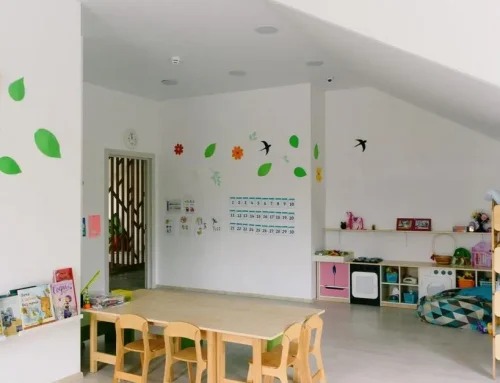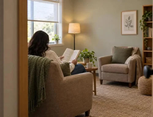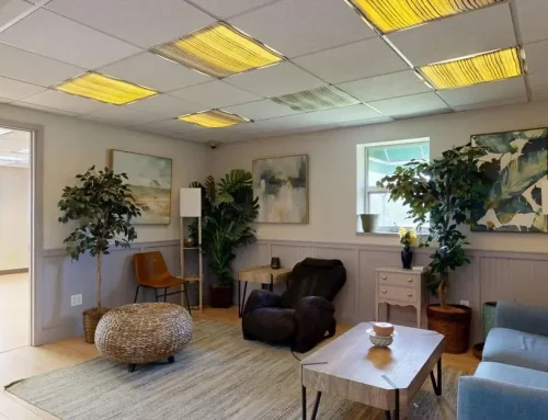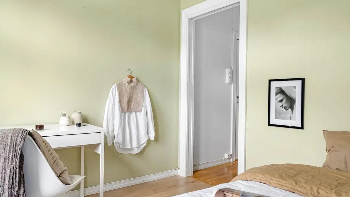
A fresh coat of paint can still leave a shelter room feeling cold, exposed, or like a place people are expected to move through quickly. Trauma-informed paint colors help change that first impression before anyone says a word.
For shelter leaders, partners, donors, and volunteers, the goal is not a trendy palette. It’s a room that lets women, children, and families exhale (especially under harsh overhead lights).
- Choose warm neutrals over bright white for less glare and less clinical feeling.
- Match color to the room: rest needs softness; intake needs steady welcome.
- Test swatches at 8 p.m., not just in daylight.
Make the room feel human.
What Trauma-Informed Paint Colors Mean in Shelter Spaces
Trauma informed paint colors are not about what looks stylish on a sample card. They’re color choices made to lower stress, avoid sensory overload, and help a person feel safer in the room they’re standing in.
That sounds simple, but in shelter settings it changes the whole decision.
A trauma-informed palette is not one perfect set of colors. It’s a way of choosing. We look at who uses the space, what happens there, how long people stay, what the lighting does by 7 p.m., and whether the room feels exposing or steady. A bedroom for a mother and child should not be chosen the same way as an intake room or a staff workroom.
In shelters and crisis centers, people often arrive tired, grieving, on alert, or unsure if they can let their guard down. The room speaks before your staff does. Color is part of that first message.
Traditional shelter painting often comes from a different logic:
- easiest color to buy again
- cheapest neutral
- whatever maintenance has always used
- bright white because it looks “clean”
We understand why that happens. Budgets are tight. Turnover is real. A paint order can feel like a minor task in a much bigger day.
But color isn’t minor. It helps a room signal welcome, predictability, and respect. Or it does the opposite.
Paint is not just finish work. In a shelter, it’s part of how safety gets communicated.
Why Color Matters More Than Most Shelter Teams Realize
Most people notice paint only when it’s bad. Residents feel it much sooner.
Before someone hears your intake process or sees available services, they read the room. Stark white walls, cold gray hallways, or harsh contrast can quietly say: temporary, exposed, managed. That’s not what any shelter leader wants to communicate, but it’s easy to land there by accident.
Color affects first impressions in a very physical way. A softer visual field can help the body settle a little. Breathing slows. Shoulders drop. The room stops asking so much of the eyes. In high stress environments, that matters more than many teams expect.
We’ve also seen the gap between what outsiders praise and what residents actually need. Donors and volunteers often respond to visible transformation. Fresh paint, coordinated furniture, cleaner lines. That’s real. But residents usually feel the deeper win somewhere else: a bedroom that doesn’t feel cold, a counseling room that doesn’t feel exposing, a family space that feels normal enough to rest in.
There is also a staff angle that gets missed. Staff spend full days in these environments. If the building feels tense, sharp, or drained of warmth, they absorb that too. A better color palette won’t solve burnout, but it can stop making the day harder.
When a full renovation isn’t possible yet, paint is often the most reachable place to start. Not because it’s cosmetic. Because it changes the emotional temperature of a room faster than almost anything else.
A Controlled Color-Room Test Shows a Short-Term Anxiety Difference
Evidence from shelters specifically is still limited, but a randomized clinical trial of 190 chemotherapy patients offers a useful signal that the visual environment can have a measurable short-term association with anxiety. After 20 minutes, participants assigned to a blue therapeutic room had a mean Beck Anxiety Inventory score 7.67 points lower than at baseline, while the standard-setting group changed by 0.65 points.
Mean Beck Anxiety Inventory scores for chemotherapy patients assigned to either a blue therapeutic room or a standard hospital setting before and after a 20-minute exposure.
| Study setting | Before exposure | After 20 minutes |
|---|---|---|
| Blue therapeutic room | 57.70 | 50.03 |
| Standard hospital setting | 56.48 | 55.83 |
Source: Randomized clinical trial of 190 chemotherapy patients.
- The trial involved chemotherapy patients in a hospital context, not shelter residents or staff.
- The intervention was a blue therapeutic room compared with a standard hospital setting; the reported evidence does not isolate wall paint from all other features of the room condition.
- Anxiety was measured after a 20-minute exposure, so it does not demonstrate long-term effects or identify a universally preferable color.
View chart data
| Study setting | Before exposure | After 20 minutes |
|---|---|---|
| Blue therapeutic room | 57.70 | 50.03 |
| Standard hospital setting | 56.48 | 55.83 |
This is not evidence that blue is a universal trauma-informed choice, nor is it a shelter study. It also cannot establish that wall paint alone caused the change. But the immediate, controlled result supports treating color as something to test with residents and staff rather than as a purely cosmetic finishing decision.
For a shelter pilot, use the same discipline: document the room condition, collect brief before-and-after feedback, and check results under the lighting and daily use the room will actually have.
The Core Principles Behind a Healing Color Palette
A healing color palette usually feels settled before it feels impressive. That’s a good test.
We lean toward low contrast combinations. Not flat, not lifeless, just visually steady. Sharp jumps between trim, walls, and doors can create tension people feel without naming. In a trauma-sensitive environment, calm usually comes from softness and continuity.
A few principles keep the palette grounded:
- Use warm, familiar tones rather than cold or clinical ones.
- Pull from nature when possible. Sage, sand, stone, clay, softened sky tones.
- Keep room-to-room flow connected so the building doesn’t feel chopped up.
- Match the color to the room’s job, not to a trend board.
- Don’t paint every room the same and call it calm.
That last point matters. Calming paint colors for trauma are not one-size-fits-all. A toddler play-adjacent family room can carry a little more warmth and variation than a quiet room used for decompression. A hallway may need more visual orientation than a bedroom. You are shaping emotional tone, not just wall coverage.
Color also never works alone. If the lighting is harsh, storage is chaotic, privacy is poor, and sound carries through every wall, even the best paint color will struggle. That’s why our Trauma-Informed Design work always looks at the whole environment. Paint helps. The room still has to function.
The Best Colors for Shelters and Why They Work
When people ask for the best colors for shelters, they’re usually hoping for a shortlist. Fair enough. There are colors we return to often, but the bigger point is how they behave in real rooms.
Warm off-whites and soft creams
These are often better than bright white by a mile. They keep a room light without turning it clinical.
They work well on ceilings, trim, and smaller bedrooms that need brightness but can’t handle glare. Under typical shelter lighting, a warm off-white stays gentler on the eyes.
Gentle greige, taupe, sand, and stone
These are some of the most reliable non institutional interior colors for shelters. They feel grounded, stable, and easy to live with.
They’re especially useful in hallways, shared bedrooms, and multipurpose rooms where you need a solid base that won’t fight with furniture, flooring, or donated items that vary from room to room.
Muted greens such as sage and earthy olive
These often do good work in spaces where regulation matters. Bedrooms, counseling rooms, quiet corners.
Green can bring in a sense of the outside world, which matters more than people think when someone has been living in disruption. We prefer softened versions, not bright leaf green.
Soft blues with gray or green undertones
Blue can calm a room, but only if it’s softened. Icy or overly crisp blues can feel sterile fast.
The better versions are settled and a little muted. They tend to work in quiet rooms, staff respite areas, and low-stimulation spaces where clarity matters.
Clay, terracotta, and muted earth tones
These add warmth and welcome, especially as accents or in buildings where the surrounding landscape already carries those tones. Used across every wall, they can get heavy. Used with restraint, they make a room feel more human.
Dusty mauves and soft lavender-grays
These are useful in select family or communal spaces that need comfort without too much energy. Done badly, they can feel overly themed. Done well, they feel gentle and restorative.
The common thread is simple. Healing color palettes are usually muted, layered, and human. Bright, flat, sterile color tends to push in the other direction.
| Color family | Why it works | Best uses | Watch-out |
|---|---|---|---|
| Warm off-whites and soft creams | Keeps a room light without turning it clinical and stays gentler on the eyes under typical shelter lighting | Ceilings, trim, and smaller bedrooms that need brightness without glare | Prefer these over bright white when glare or a clinical feel is a risk |
| Gentle greige, taupe, sand, and stone | Feels grounded, stable, and easy to live with as a reliable non institutional base | Hallways, shared bedrooms, and multipurpose rooms | Best when you need a base that will not fight with varied furniture, flooring, or donated items |
| Muted greens such as sage and earthy olive | Supports regulation and brings in a sense of the outside world | Bedrooms, counseling rooms, and quiet corners | Use softened versions rather than bright leaf green |
| Soft blues with gray or green undertones | Can calm a room when the blue is settled and a little muted | Quiet rooms, staff respite areas, and low-stimulation spaces where clarity matters | Avoid icy or overly crisp blues because they can feel sterile fast |
| Clay, terracotta, and muted earth tones | Adds warmth and welcome and can make a room feel more human | Accents and buildings where the surrounding landscape already carries those tones | Can get heavy when used across every wall, so use with restraint |
| Dusty mauves and soft lavender-grays | Can feel gentle and restorative without adding too much energy | Select family or communal spaces | If handled poorly, they can feel overly themed |
Colors to Use Carefully or Avoid in Trauma-Sensitive Environments
Very few colors are automatically wrong. Placement, intensity, and lighting matter more than the swatch name. Still, some choices create problems often enough that they deserve caution.
Bright stark white is the usual one. It can read as clean on paper and harsh in practice. In many shelters, especially under cooler bulbs, it increases glare and makes everything feel more exposed.
Very dark colors across broad surfaces can also backfire. They may look sophisticated in photos, but in small bedrooms or narrow halls they can feel heavy and harder to navigate. If someone already feels unsafe, that closed-in feeling is not neutral.
A few more to watch:
- highly saturated red, orange, or yellow on large walls
- strong color blocking between walls, trim, and doors
- gray-on-gray palettes that slip from calm into lifeless
- blank minimalism that strips away warmth in the name of simplicity
One-note minimalism is a sneaky problem. Teams try to avoid overstimulation and end up with spaces that feel emotionally empty. People don’t heal well in rooms that look like nobody expected them to stay.
Neutral is not the same as calming.
Shelter Room Color Ideas by Space
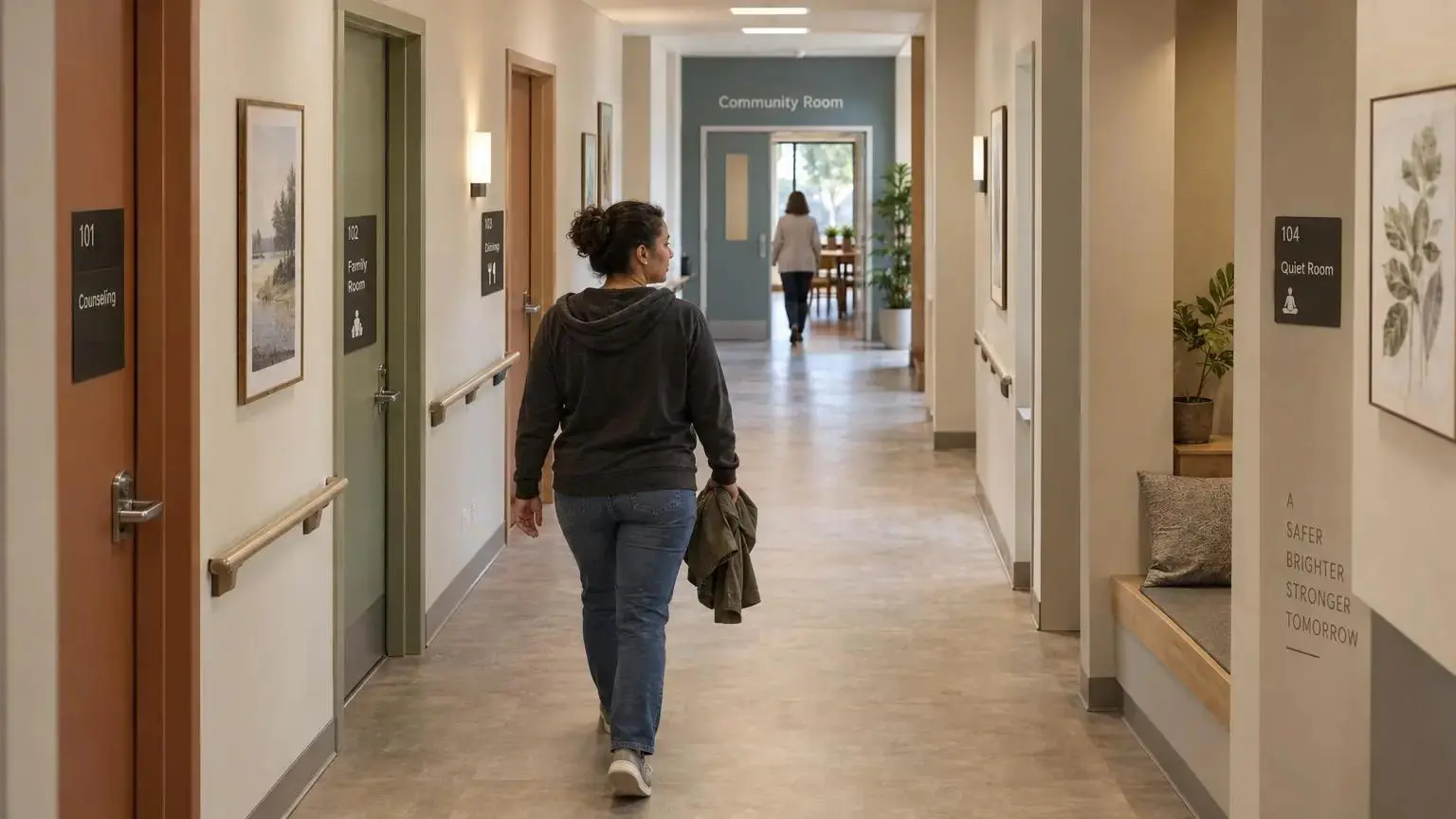
The right shelter room color ideas depend on what the room is trying to help someone do.
Bedrooms and family sleeping rooms
Keep these simple. Warm neutrals, sage, muted blue-gray, and gentle earth tones usually work well. Too much variation makes rest harder. Bedrooms should feel private, soft, and not overly watched.
Intake and reception areas
This is where people decide, often within seconds, whether they can trust the environment. Warmer neutrals with restrained accent color tend to work better than corporate blues or clinical white. You want steady, not slick.
Hallways and circulation spaces
These spaces often get ignored, then they end up feeling like institutions. Use connected tones that make transitions easy to follow. Wayfinding can come from subtle shifts, door colors, or signage. It does not need to shout.
Counseling rooms and quiet rooms
This is where calming paint colors for trauma matter most. Muted greens, soft taupes, and settled blue-greens are strong options. If someone is processing crisis in that room, visual softness matters.
Dining rooms and community spaces
These need a little life without becoming loud. We often think about ordinary, everyday environments here. Not fancy. Just normal. A room that feels a bit more like a cafe and a bit less like a program room can support dignity and routine.
Family rooms and play-adjacent spaces
You can introduce more color variation here, but keep the palette regulated overall. Comforting tones work better than highly playful primaries splashed everywhere. Children need stimulation. They also need calm.
Staff workrooms and respite areas
Staff need humane environments too. Soft blue-green, warm neutral, or subdued stone tones can help support clarity and recovery between hard moments. If the staff space feels punishing, the rest of the building feels it eventually.
How to Build a Trauma-Informed Color Palette Step by Step
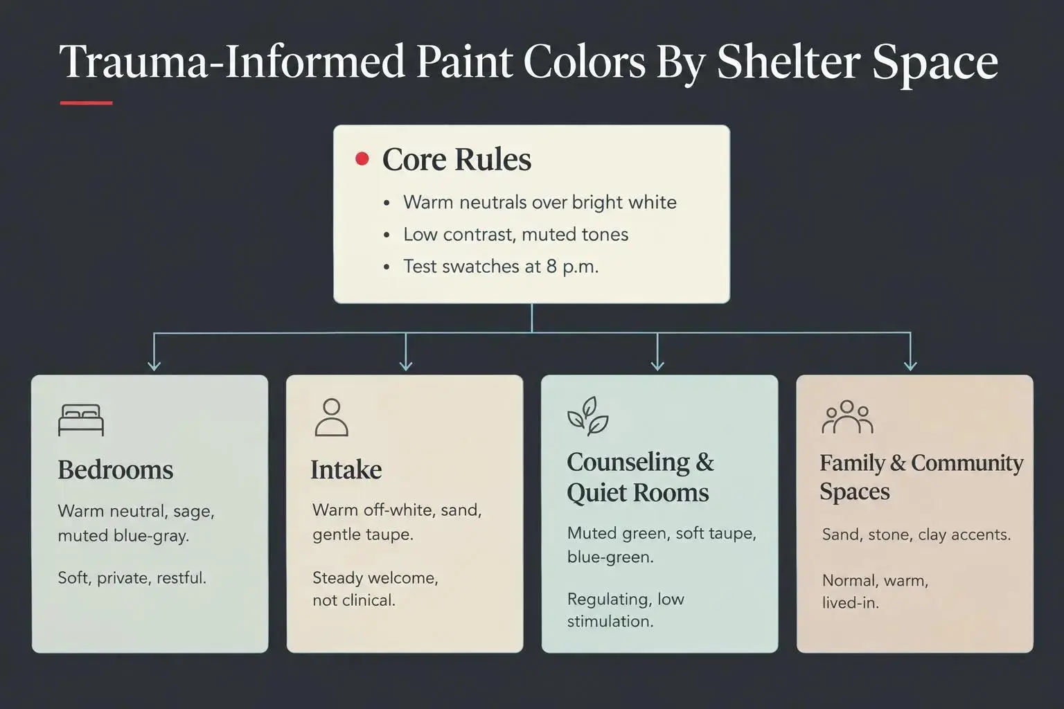
A good palette usually comes from a disciplined process, not a lucky pick.
Start with the population served. Women fleeing violence, children in transition, and families in temporary housing won’t all read space the same way.
Name the purpose of each room. Rest, intake, play, counseling, meals, and staff recovery need different emotional tone.
Study the light. A color that looks warm at 11 a.m. can look flat or green by evening under the wrong bulb. This is where many good intentions go sideways.
Choose two to four base colors first. Get your grounding tones set before chasing accent colors.
Use accents carefully. A little character helps. Too much stimulation doesn’t.
Test on multiple walls. Look at samples during the day, at night, and during normal use. We never trust a paint chip by itself.
Think in transitions. The facility should feel cohesive from entry to bedroom, not like separate decorating decisions stitched together.
Pair color with broader design choices. Privacy, layout, lighting, storage, and sound all affect whether paint can do its job. This is exactly why our Trauma-Informed Design approach looks at the whole room, not just the walls.
Start with one room or one wing if needed. A pilot space can teach you a lot before you scale.
Small starts are fine. Random starts are where trouble begins.
Practical Paint Selection Tips for Nonprofits, Donors, and Shelter Leaders
Most teams are balancing care goals, budget limits, donated materials, and a building that wasn’t designed for this work in the first place. So the paint decision has to be usable, not precious.
A few filters help:
- Does this color feel safe?
- Does it reduce institutional cues?
- Does it fit the room’s purpose?
- Does it work with the rest of the building?
Use those four questions before anyone debates undertones for forty minutes.
It’s also worth involving the right people early. Frontline staff usually know which rooms feel tense, where people struggle to settle, and which corners never quite work. When appropriate, resident input can help too, as long as it feels respectful and not like one more demand on people already carrying too much.
For donors, paint is often one of the easiest things to understand once it’s framed correctly. It is visible, yes, but it also changes dignity and emotional comfort at a relatively manageable cost. That’s a strong place to invest.
If your need is room by room, our Room Makeovers are built for that kind of focused transformation. If the pressure points extend into intake areas, dining halls, common spaces, and multiple resident zones, full shelter renovations usually make more sense than isolated paint fixes.
Common Mistakes That Keep Shelter Spaces Feeling Institutional
Most institutional-feeling rooms are not the result of one bad color. They’re the result of a decision pattern.
Paint gets chosen last. Bright white wins because it’s familiar. Samples never get tested in the actual room. Then everyone wonders why the space still feels cold after the furniture arrives.
We see the same mistakes repeatedly:
- choosing paint after everything else, as if color doesn’t shape the room
- using bright white because it seems safe or clean
- selecting from a catalog without checking real building light
- going so neutral that the room ends up bland instead of comforting
- adding too many accent walls in shared spaces
- ignoring flooring, wood tone, metal furniture, and daylight
- refreshing public areas while resident bedrooms stay generic and cold
The deeper mistake is treating trauma-informed design like a style. It isn’t one. It’s a way of making choices through the lens of safety, dignity, and regulation.
That lens changes what “good” looks like.
How to Tell Whether Your Color Choices Are Working
You don’t need a complicated evaluation plan to tell whether the palette is helping. You do need to pay attention.
Start with observable signs of ease. Do residents settle more quickly? Do rooms get fewer comments about feeling cold? Are people more willing to personalize the space, rest there, or use it as intended?
Staff feedback matters too. Staff often notice changes in room tension before anyone else does. Intake may feel less intimidating. A counseling room may hold conversation more easily. A bedroom may finally feel like somewhere a family can exhale.
Look for a few practical signals:
- the room feels less clinical
- the purpose of the room is easier to support
- people linger a little more comfortably
- the palette still works under daily wear and actual lighting
Gather simple before-and-after feedback if you can. Nothing elaborate. Just enough to keep the team from relying on assumptions.
And revisit the palette after installation. Some colors behave differently once they’re fully on the wall, under shelter lighting, next to existing finishes. Adjusting is not failure. It’s part of doing this honestly.
Conclusion
Trauma informed paint colors are one of the most practical ways to help shelter spaces feel safer, calmer, and more dignified for people recovering from crisis. Not because paint solves everything. Because color changes how a room meets a person.
The strongest choices usually avoid harsh institutional defaults, lean into low-contrast and nature-informed tones, match the room’s purpose, and work as part of a full healing color palette rather than isolated walls.
If you’re not sure where to begin, start with one space and one clear question:
Does this room help someone exhale?
That’s a better standard than “Does it look finished?”
And if you’re ready to move from shelter room color ideas to a full trauma-informed plan, we can help. Sometimes that means a focused room makeover. Sometimes it means rethinking larger shared spaces through a design approach grounded in safety, dignity, and healing.