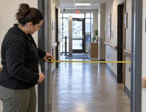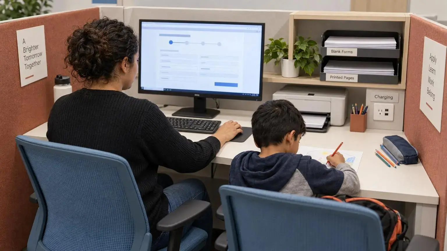
A resource room setup can quietly raise stress when screens face the door, printers roar beside job applications, and every spare surface becomes storage. For shelter and crisis center leaders, that matters when residents are handling deadlines they can’t miss.
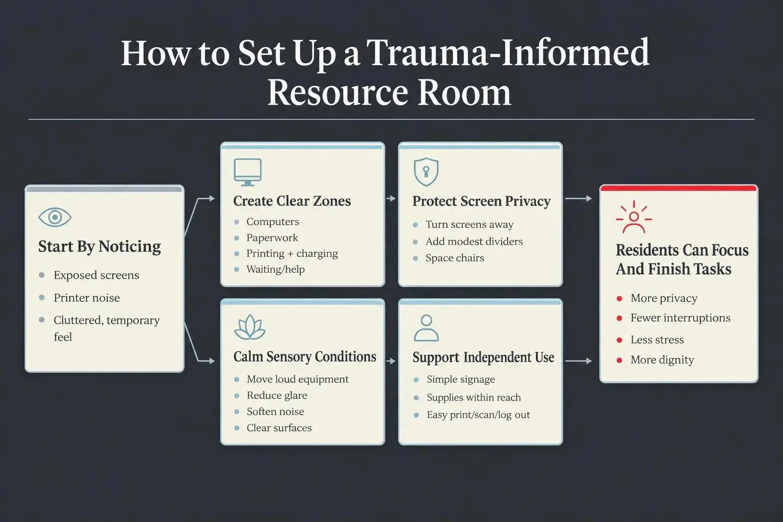
What works is not expensive decoration. It’s clear zones, protected screens, calmer sensory conditions, and tools residents can use without asking permission at 3 p.m.
Start by noticing:
- Which computer screens are visible from the entrance
- Where printer noise interrupts private tasks
- What makes the room feel temporary instead of usable
Make practical next steps feel possible.

What a Trauma-Informed Resource Room Setup Includes
A good resource room setup is not just a room with a few computers and a printer that jams twice a week. In shelter settings, it’s a shared support space where residents handle next steps that are often urgent, private, and stressful.
That means the setup has to account for more than equipment. It includes layout, technology, storage, privacy, lighting, sound, traffic flow, seating, signage, and the rules that shape how the room is used day to day.
Depending on your program, the room may work as:
- a resident technology room for email, school portals, and account access
- a job search area in shelters for resumes, applications, and interview prep
- a paperwork and referral space for benefits, housing, legal forms, and case documents
- a digital access space in crisis centers where residents connect with family, agencies, telehealth, or court systems
The trauma-informed part matters because these tasks don’t happen in a neutral emotional state. Residents may be carrying grief, anxiety, hypervigilance, brain fog, sleep loss, or a hard deadline that cannot move. A purely functional computer lab misses that reality.
A trauma-informed room gives people some choice. It reduces visual confusion. It protects dignity when someone is doing something as ordinary and exposed as resetting a password while their child is tugging on their sleeve.
Design is not decoration here. It’s part of how the room treats people.
Most leaders we talk to are trying to solve the same problem: how do we create a room that works hard operationally without feeling harsh, exposed, or institutional? That’s the real question.
Why the Setup of a Resource Room Shapes Resident Outcomes
People do better work in spaces that don’t fight them. That sounds obvious, but shelters are often asked to accept the opposite.
Job applications, benefits forms, housing searches, legal communication, and school coordination usually happen when a resident is already overloaded. Add glare, noise, clutter, and no privacy, and even simple tasks start to fall apart. We’ve seen rooms where the printer sits beside the only desk, staff cut through every five minutes, and the screen faces the doorway. Technically usable. Practically exhausting.
Some common stress drivers show up again and again:
- fluorescent lighting that feels sharp by the second hour
- piles of forms on every flat surface
- mixed storage that turns the room into part office, part closet
- chairs that wobble, squeak, or make people want to leave
- constant foot traffic behind seated users
A stronger resource room setup doesn’t solve every barrier, but it does remove friction that shouldn’t be there in the first place. Residents can focus longer. They get interrupted less. They don’t need to ask staff where everything is. They can finish the task they came in to do.
There’s an emotional shift too. A room can quietly say, “we planned for you,” or it can say, “make do.” People notice. Especially in crisis.
At A Lotta Love, we don’t see practical rooms as separate from healing work. Trauma-informed design can reduce stress, support dignity, and give people a little more steadiness while they do very practical things. That matters more than most room budgets admit.
Start With Readiness, Purpose, and the Real Use of the Room
Before you buy furniture or add a bank of laptops, stop and define the room. Not in broad mission language. In actual use.
Ask what happens there every week. Usually it’s some mix of:
- job search and resume help
- benefits applications
- school enrollment and school communication
- court, housing, or case management paperwork
- telehealth or private calls
- printing, scanning, copying
- device charging
- quiet personal communication
Then look at who uses it most. Parents with children. Survivors who need discretion. Residents with low digital confidence. Staff who help people log in, print, scan, and recover accounts. The room has to work for the real users, not the imagined tidy ones.
A few readiness questions are worth asking early:
- Is leadership aligned on the room’s purpose and rules?
- Do staff have the time to manage access, supplies, and upkeep?
- Can you gather resident input before making changes?
- Is there budget for replacement and maintenance, not just setup?
That last one gets skipped too often. A room doesn’t stay calm on intention alone.
Participatory planning matters here. Residents and frontline staff will tell you things a floor plan won’t. Which station feels too exposed. Where people queue awkwardly. Which printer creates a bottleneck. Which “quiet room” isn’t quiet at all because the hallway door slams every ten minutes.
Our Trauma-Informed Design process starts there on purpose. We want to understand resident and staff needs before changing the environment, because a room can look better and still function worse if you skip that step.
What Residents Say They Would Use Internet Access For
A resource room needs to support more than job applications. In a 2019 survey of current and former family-shelter residents in Manhattan and the Bronx, respondents identified several uses they would make of internet access if it were available in the shelter. The City Bar Justice Center report documents intended use across housing, communication, health care, employment, benefits, and social connection.
The results make a practical case for planning the room around several kinds of tasks, not just a resume station. At least 60% of respondents identified housing search, email, medical care, or job search as potential uses. That means reliable Wi-Fi, working devices, and printing or scanning support can affect multiple urgent tasks during the same visit.
Plan the Room in Zones Instead of Treating It as One Open Utility Space
A resource room setup works better when the room is readable at a glance. People should know where to go without getting a tour every time.
That usually means dividing the room into zones instead of one open utility space:
- computer stations for focused digital tasks
- a paperwork surface for forms, reading, or sorting documents
- printing, scanning, and charging away from seated users
- a staff support point for quick help
- a small waiting or transition spot near the entrance
The waiting space matters more than people think. If there’s nowhere to pause, residents hover behind computer users. That raises stress fast.
Circulation should be simple. Avoid layouts where people must cross behind every monitor to reach the printer. If a room only works once you’ve explained it three times, the layout is doing too much work.
Visual access is a balance. Residents should be able to understand the room before entering. Staff need reasonable sightlines for safety. Users still need enough separation to focus and protect confidentiality. That’s not a contradiction. It’s just design.
You can define zones without making the room feel rigid. Rugs, shelving, furniture orientation, lighting changes, and subtle color shifts all help. A room shouldn’t feel overcontrolled. It should feel legible.
Build Safer Computer Stations With Privacy and Choice
Computer station privacy for shelters deserves more attention than it usually gets. Residents may be searching for housing, sending legal documents, checking benefits, messaging family, or trying to explain a gap in employment. None of that should happen with an audience.
Privacy doesn’t require sealed cubicles. It requires thought.
Set stations up so:
- monitors angle away from the entrance and main walkway
- screens are not the first thing visible when someone walks in
- side panels or modest dividers block casual viewing
- chairs have enough space between them
- at least one station offers more seclusion when space allows
We’d rather have three well-placed stations than six exposed ones.
Safety still matters, so avoid fully enclosed corners that are hard to supervise. The sweet spot is a station that feels protected, not trapped.
Choice helps regulation too. If possible, give residents a more open seat and a more sheltered one. Being able to choose when to interact, and with whom, supports autonomy in a very direct way.
Don’t ignore the physical setup. Stable chairs with back support. Work surfaces deep enough for a keyboard, paper notes, and a personal item. Heights that work for different bodies and mobility needs. A bad chair can end someone’s application session early. It sounds minor until it isn’t.
Design a Job Search Area in Shelters That Feels Capable, Not Temporary
A job search area in shelters needs more than internet access. Residents are often uploading IDs, updating resumes, checking email, scanning forms, and trying to sound composed on employer calls while under real pressure.
The room should reduce friction, not add it.
Include the practical basics that people reach for mid-task:
- reliable power access
- a nearby printer and scanner, but not right beside every workstation
- folders, envelopes, and a small document organizer
- a clean writing surface for notes
- clear instructions for printing, scanning, and logging out
If you have the space, a small phone or interview nook helps. It doesn’t need to be elaborate. It does need to keep someone from taking a screening call next to a humming copier.
This is where leftover furniture causes more harm than people expect. A room full of visible storage bins, mismatched chairs, and donated castoffs reads as temporary. That’s not a small aesthetic issue when someone is trying to picture themselves back at work.
Order matters. Adult scale matters. Durable, calm furnishings matter.
A capable room tells residents, without saying a word, that their next step is worth proper support.
Reduce Sensory Stress Through Lighting, Sound, Materials, and Color
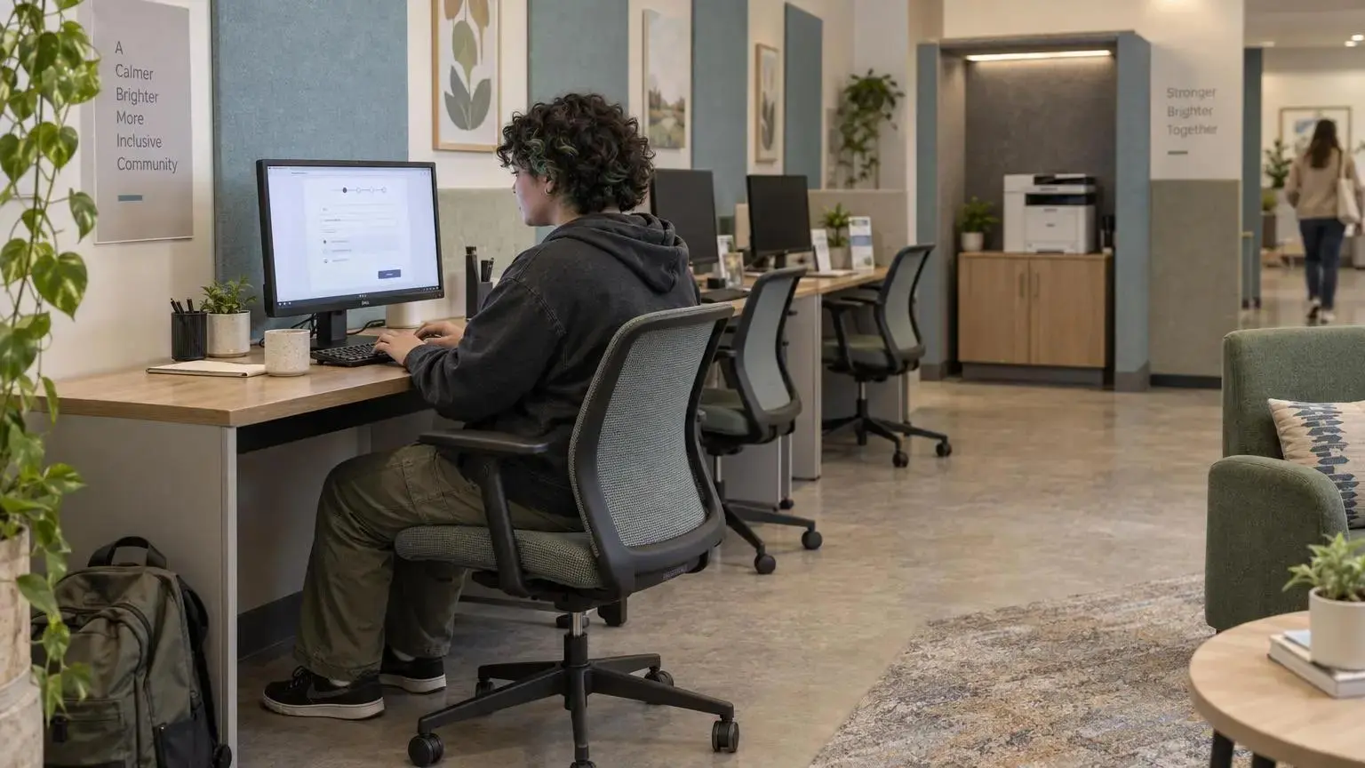
Some resource rooms fail because they overload the nervous system before anyone logs in.
Lighting is usually the first culprit. Harsh overhead fixtures, glare on monitors, and stark contrast make focused work harder. Softer, more even light helps people stay with the task longer. If you can’t replace fixtures yet, start by adjusting placement, adding task lighting where needed, and reducing direct monitor glare.
Sound is next. Printers, hallway traffic, doors, and side conversations stack up quickly. Separate louder equipment from computer stations if you can. Use soft surfaces where appropriate to cut echo. Even one rug or a few acoustic choices can change how a room feels by the afternoon.
Materials carry a message too. Choose finishes that are easy to clean but don’t feel punitive. Warm wood tones or natural-looking textures can soften an institutional room without making upkeep harder. Very dark or severe choices often make shared spaces feel closed off.
Color should support orientation, not compete for attention. Keep the palette simple. Use subtle differences to mark zones or guide movement. Too much contrast can make a small room feel busy and unsettled.
This supports staff too. A room that keeps residents more regulated is usually easier to manage.
Make the Room Easy to Navigate for People in Crisis
Wayfinding is not an extra. In a shelter or crisis center, it’s part of care.
People in crisis may be anxious, distracted, depressed, sleep deprived, or carrying too much information at once. Even a straightforward room can feel confusing in that state. So make it easy to read.
Use clear signage for:
- computers
- printer
- scanner
- charging area
- forms and supplies
- help point
- quiet area
Words help, but words alone are not enough. Add simple pictograms. Keep labels readable and placed where people actually look, not wherever there happened to be wall space.
Consistency matters more than cleverness. If folders, supplies, and devices move every week, residents have to relearn the room each time. That’s tiring.
Accessibility needs to be built in, not added later. Keep routes clear for mobility devices. Place labels at usable heights. Think about screen visibility, task lighting, and seating options for residents with different physical and sensory needs.
A room that people can navigate independently lowers pressure on staff. It also protects dignity in a small but real way.
Keep Resources Visible, Organized, and Dignified
There is a difference between organized access and visual overload. A lot of resource rooms miss it.
Not every flyer belongs on the wall. Not every brochure needs to be visible at once. When everything is out, nothing is findable.
A better approach looks like this:
- keep a limited set of high-use resources in open view
- store backstock, staff items, and extra paper behind closed doors
- label bins and folders clearly
- protect confidential or easily misused materials
- leave counters and tables mostly clear
A simple hierarchy helps:
- immediate action items
- ongoing support resources
- community referrals
Too much paper on the walls becomes wallpaper. Hidden resources create the opposite problem and make residents feel they need permission to ask for basic help. The room should offer access without chaos.
Clear surfaces matter more than they seem to. A resident should be able to set down a folder, sit, and work without first clearing a pile of outdated handouts.
Respect often shows up as order.
Support Families, Children, and Shared Use Without Sacrificing Function
Many residents using the room are not alone. They’re helping a child with homework, keeping a toddler occupied, or trying to finish a form while managing family life in real time. Your resource room setup should reflect that reality.
A few moves help a lot:
- place a nearby seat beside at least one parent workstation
- offer one calm activity option for children that doesn’t create noise chaos
- secure cables and cords carefully
- use durable finishes that can handle heavy daily use
Children are affected by harsh light, noise, and visual confusion too. A room designed only for solo adult use usually breaks down quickly in shelter life.
If your layout allows it, peripheral seating or a small alcove-like spot can help caregivers stay connected to the room without sitting in the middle of the busiest zone. Sometimes people need to be present without being fully in it.
Room rules matter here. Family presence shouldn’t be treated as a disruption by default. It should be planned for with dignity.
If you’re seeing these same pressures across multiple shared spaces, not just this one room, broader planning may make more sense. That’s often when a coordinated renovation approach becomes more useful than fixing rooms one by one.
Use a Phased Process to Improve the Room Without Losing Momentum
You do not need to solve the whole room in one meeting. In fact, that’s usually where things go sideways.
A steady process works better:
Phased setup process
- Readiness
determine readiness and goals
- Assessment
assess the current room
- Design plan
develop and test a design plan
- Installation
install changes with clear communication
- Maintenance
maintain the room over time
During assessment, document the details that actually affect use. Where crowding happens. Which surfaces collect clutter. Which stations feel exposed. When noise peaks. What residents avoid. What staff keep apologizing for.
Before buying, test the plan. Tape out furniture footprints. Mock up station placement. Walk the route from entrance to printer. Small trials catch expensive mistakes.
Installation needs communication. If the room will be partly offline for a few days, residents and staff need to know in plain language. Surprises feel bigger in high-stress settings.
Then comes the part people underestimate: sustainment. Check cables, printer supplies, furniture condition, signage, and visual order. Revisit the room after launch. Real use will reveal something you didn’t predict. It always does.
For organizations that want a more structured, resident-centered process, this is exactly where trauma-informed design support can help.
Low-Budget Computer Room Ideas for Shelters That Still Change the Experience
Not every shelter needs a full renovation to improve the room. Some of the best computer room ideas for shelters are basic, inexpensive, and overdue.
Start with changes that directly affect stress, privacy, and usability:
- turn desks so screens aren’t exposed
- remove old flyers and extra paper
- replace unstable or mismatched chairs
- add modest privacy panels
- move printers and loud equipment away from focus areas
- repaint in calmer tones where feasible
- improve labels and room navigation
- add closed storage for backstock and clutter
Many shelters already have the core equipment. What they’re missing is room logic.
That said, incremental changes have limits. If the layout is fundamentally wrong, the lighting is harsh throughout, the flooring adds noise, or the room can’t handle daily wear, furniture tweaks won’t fix the deeper problem. That’s when a larger common-area redesign may be the better path.
| Room issue | Low-budget move to try first | Escalate to a larger redesign when |
|---|---|---|
| Screen privacy | Turn desks so screens are not exposed and add modest privacy panels. | The layout still forces screens into view or requires people to cross behind monitors. |
| Clutter and backstock | Remove old flyers and extra paper, and add closed storage for backstock and clutter. | The room keeps functioning as storage overflow and daily use makes visual order hard to maintain. |
| Chairs and workstation comfort | Replace unstable or mismatched chairs first. | The room and furnishings cannot handle daily wear, or the work surfaces and clearances are wrong for real users. |
| Noise around focused tasks | Move printers and other loud equipment away from focus areas. | Loud functions still cannot be separated, or the flooring and circulation pattern keep adding noise. |
| Harsh lighting and overstimulating finishes | Repaint in calmer tones where feasible and reduce direct monitor glare. | The lighting is harsh throughout the room, so surface-level changes cannot create calmer conditions. |
| Wayfinding and overall layout | Improve labels and room navigation with clearer, more consistent cues. | The layout is fundamentally wrong, so better labels still do not make the room easy to read or move through. |
Common Resource Room Setup Mistakes That Undercut Safety and Dignity
Some mistakes are so common they’ve started to look normal. They shouldn’t.
Watch for these:
- using the room as storage overflow
- placing computer screens in direct view of the entrance
- relying only on leftover furniture that is uncomfortable or chaotic
- mixing loud equipment, staff conversations, and focused tasks in one zone
- covering walls with too many notices
- creating confusing sign-in systems or rules that feel suspicious
- ignoring parents, children, and residents with low digital confidence
- launching changes without a maintenance plan
The deeper mistake is treating functionality as the finish line. A room can technically function while still making people feel exposed, rushed, and unwelcome.
That’s too low a bar.
Conclusion
A trauma-informed resource room setup helps residents do practical things in a space that also supports safety, clarity, and self-direction. That’s the goal. Not a prettier room. A better working room for people carrying a lot.
The priorities are usually straightforward: define the purpose, create clear zones, protect privacy, reduce sensory stress, make navigation simple, organize resources with dignity, and keep the room up over time.
If you’re rethinking your space, walk through it as a resident would. Notice what feels exposed, noisy, confusing, or temporary. Those are not minor details. They shape whether the room helps or hinders the person using it.
If you want a more structured way to rethink shared shelter spaces, our trauma-informed design process brings resident needs, staff realities, and environmental change into one plan. That’s where good intentions start turning into rooms that actually work.